What’s new in iObeya 4.31 – On-premises Version?
Disclaimer 📢
This on-prem version combines the new features and bug fixes that were already available for iObeya Cloud versions 4.21 to 4.31. However, some additional improvements or bug fixes may have been added to the list to make this version certified for on-prem deployments.
Attention ✋
iObeya 4.31 on-premises introduces compatibility with Java 17. This change in the technical requirements impacts both the installation and upgrade procedures, requiring additional steps. You must carefully review the technical requirements and the upgrade procedure before proceeding with the installation of version 4.31 on your iObeya platform.
General features
Interactive web content
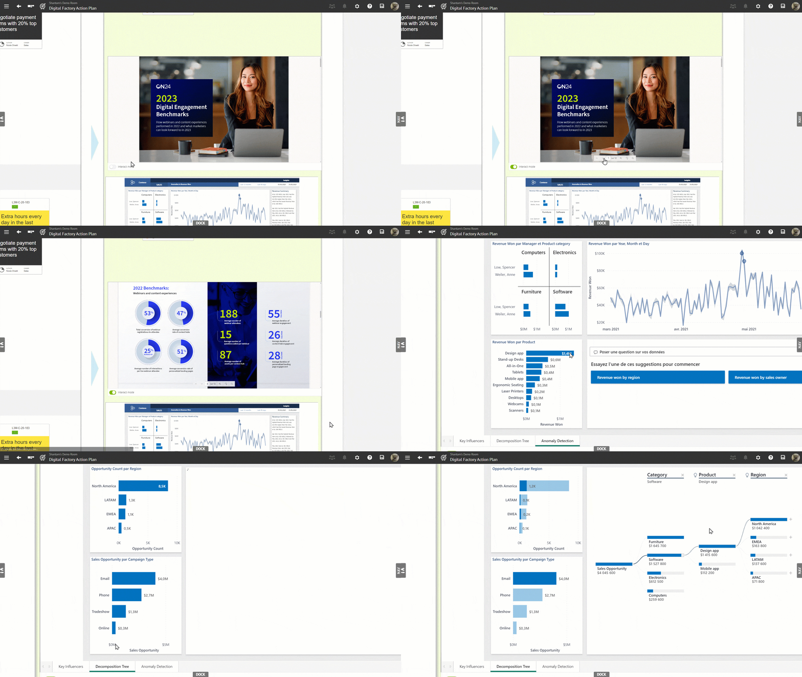
Since iObeya 4.20, a large majority of iObeya customers have adopted our web content feature to display their online external content directly on their iObeya boards. Since the roll-out of this feature there has been one improvement that has been asked for by all our web content users which is to be able to interact with external content within iObeya.
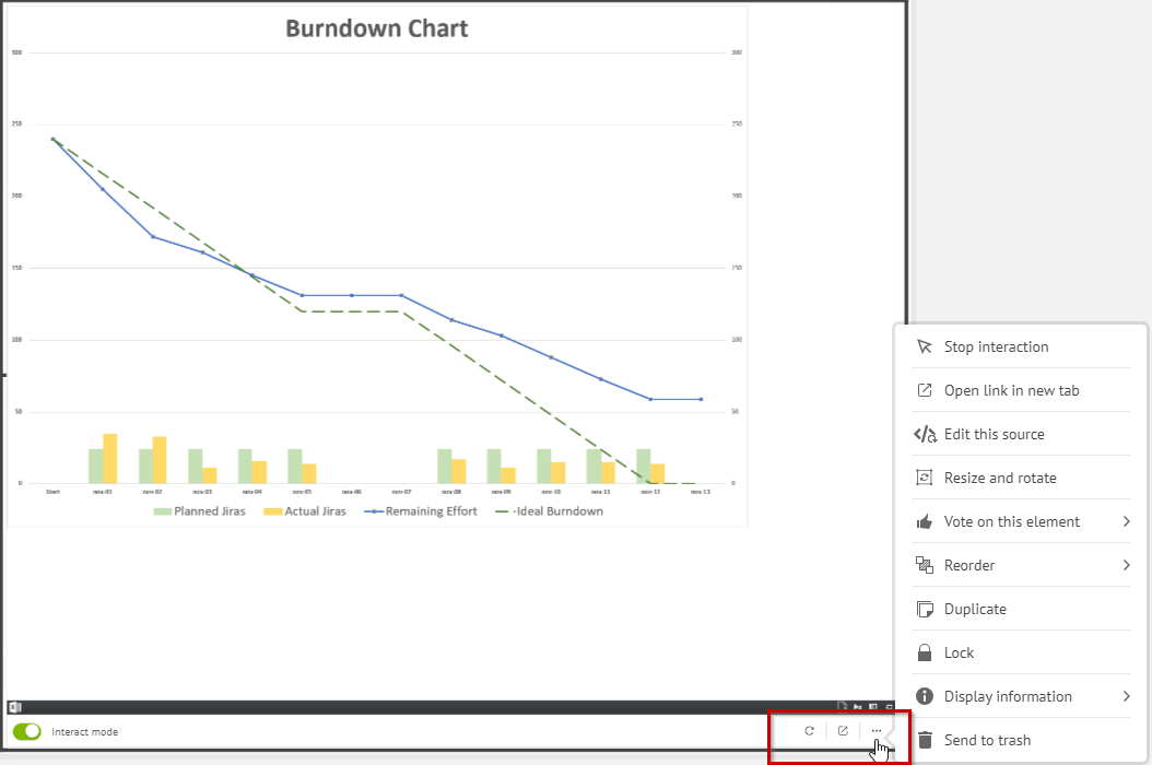
With the release of this new version, we are thrilled to announce that this wish has now become a reality! At the bottom of your web content element, you will find a bar with a switch to toggle on/off the interactive mode. You can also double click click on a web content to start interacting with it. A bit of a change here, earlier if you double clicked on the element, it opened your content in a new tab. You can still open the external content in a new tab via the contextual menu. If the interact mode is on, this contextual menu can be opened by clicking on the bottom bar at any time.
Another precision, while the interactive mode is activated, if you click anywhere else in iObeya the interactive mode will automatically switch off, to ensure an intuitive user experience in iObeya and to avoid interaction conflicts that you might face when using iObeya tools and interacting with web content at the same time.
Introducing scaling option for embedded content in iObeya
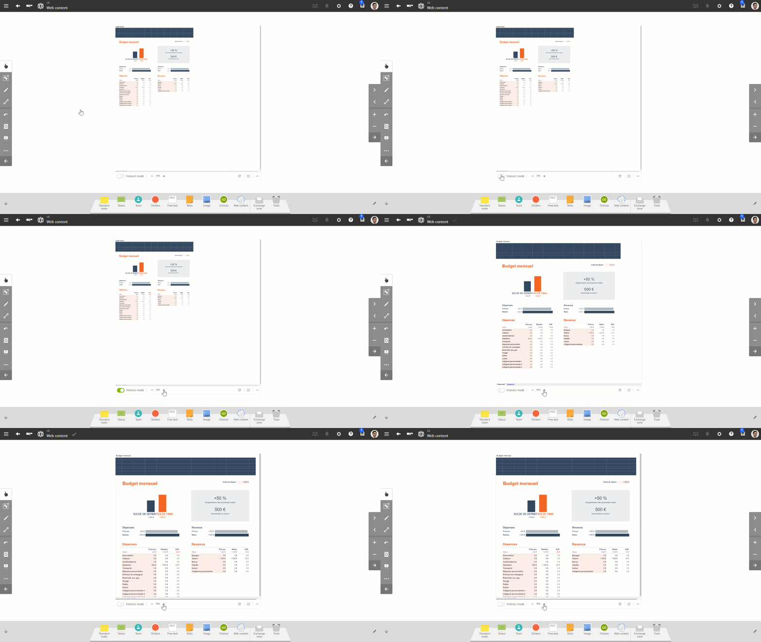
We’ve rolled out a groundbreaking enhancement for web content tool that allows you to fine-tune the zoom level for embedded content, making it a breeze to read and interact with. No more squinting at small text or struggling to navigate through oversized documents, you can easily adjust the zoom ratio right from the toolbar of any web content element.
But here’s the best part – your chosen zoom setting isn’t just limited to your current session. We’ve designed it to be stored and shared collaboratively with your team, ensuring everyone enjoys the same optimized viewing experience, no matter when they access the boards.
Visual Management is all about keeping things consistent and making sure everyone’s on the same page! It’s the little things that make a big difference, after all. So go ahead, tweak that zoom level, and watch as your collaboration becomes even smoother and more efficient thanks to iObeya!
Web content improvements
As part of our continuous delivery cycle for the web content feature we also have introduced new improvements with this version.
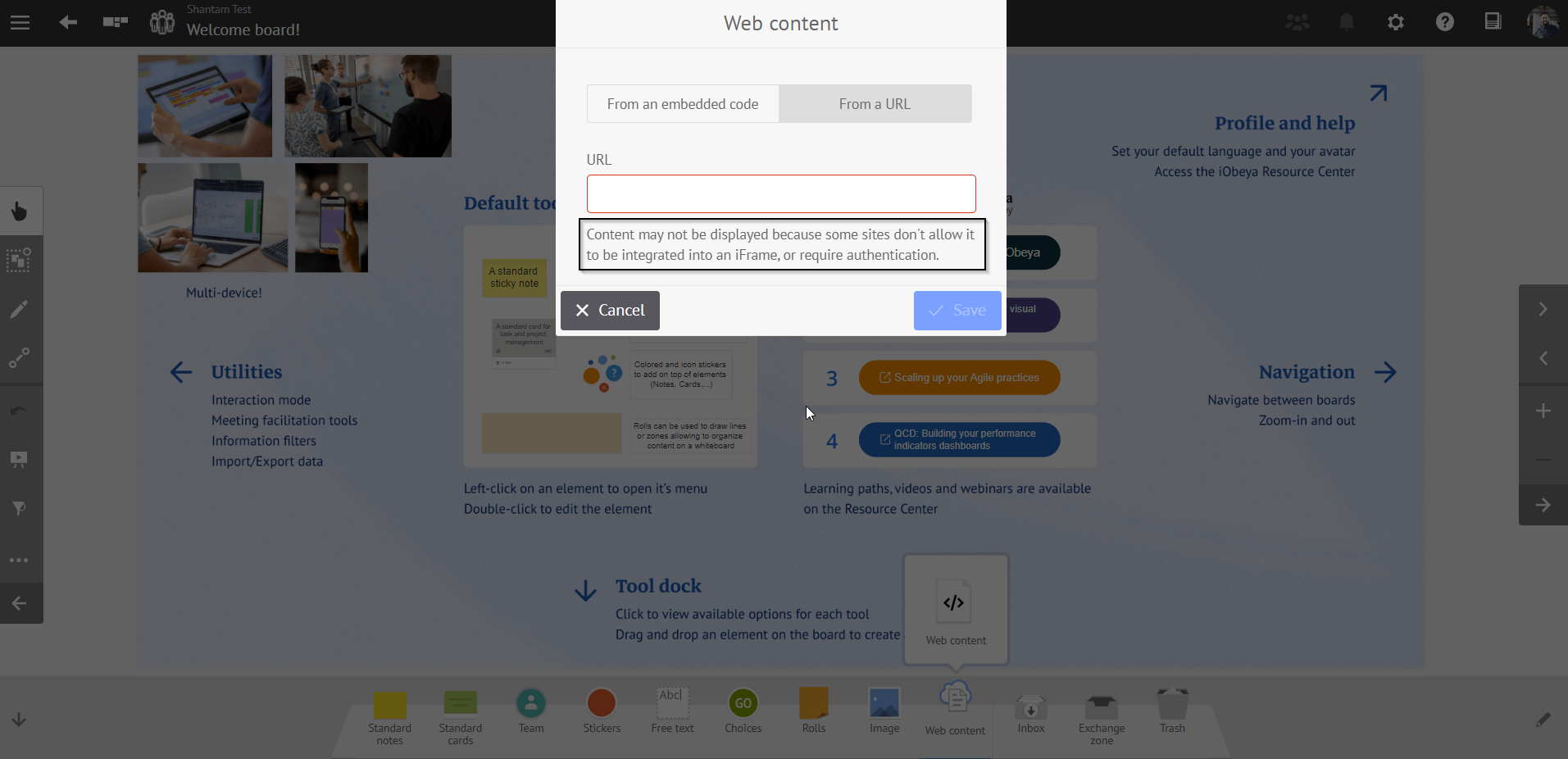
Firstly, until now to use a web content tool the user needed to paste the embed code of the website in the element. We understand that this code can be difficult to find for many users so to simplify the use of web content for our users in this version we have brought the possibility to add web content on a board by directly copy pasting the website URLs into the web content tool!
However, all websites do not allow embedding content through the use of URLs. Therefore, you should first check if the source application or website offers an option to generate an embed code and use it instead of using the direct link. This maximizes the chance for your embedded content to work and to be displayed in iObeya. It is particularly true for Microsoft Sharepoint or Office 365 content for instance.
If you add a URL and it does not work, you should check if the website allows embedding in third party applications.
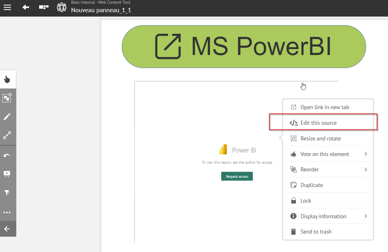
Also, before if you needed to edit/change the source of the web content tool on your board you had to delete the existing web content element on the board and create a new one. To make it easier to use the tool we have also brought the ability to directly edit the embed code, or the url in the existing web content elements on the board. Just open the contextual menu of the element and you will find the option Edit this source there!
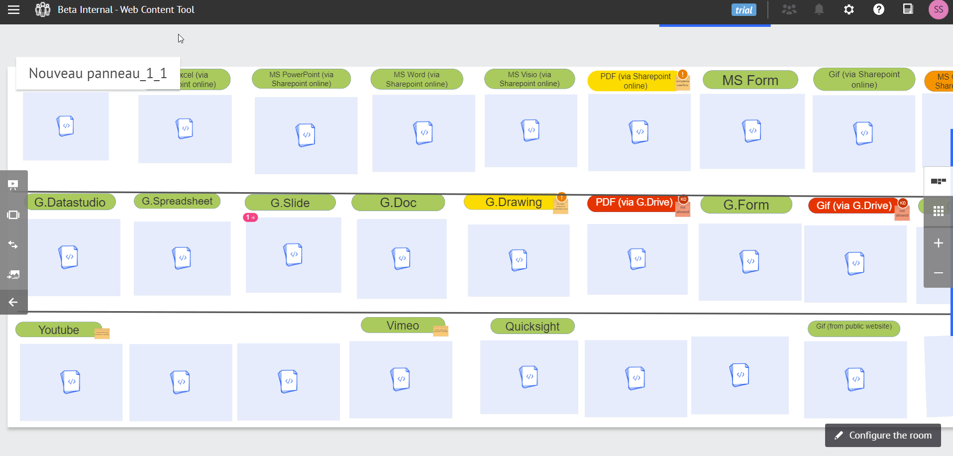
Lastly, to allow the user to identify which elements are web content, or to highlight if a web content element is not working, we have updated the visual design of the placeholders for the exchange zone, trash, visual export, slideshow, room views etc.
We also worked on one of the long-standing web content improvements demands raised by the iObeya community: being able to refresh documents embedded via a web content element on an iObeya board without needing to refresh the entire board. For this, we have added a refresh button to the bottom bar of web content elements. This feature is particularly useful when integrating documents from applications that don’t support real-time updating.
We’ve also added two more shortcuts to quickly open the document in a new tab and open the contextual menu from the control bar, to enhance the usability of the web content tool.
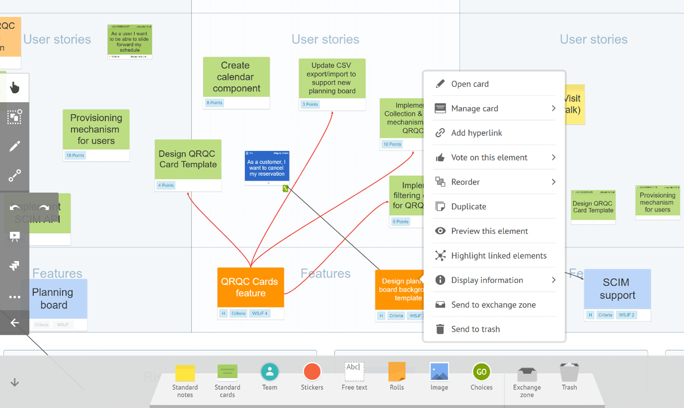
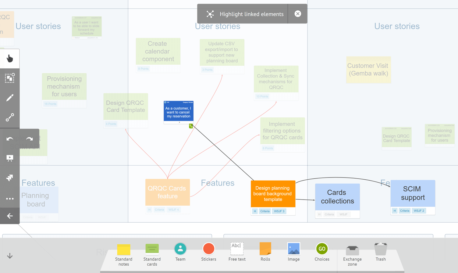
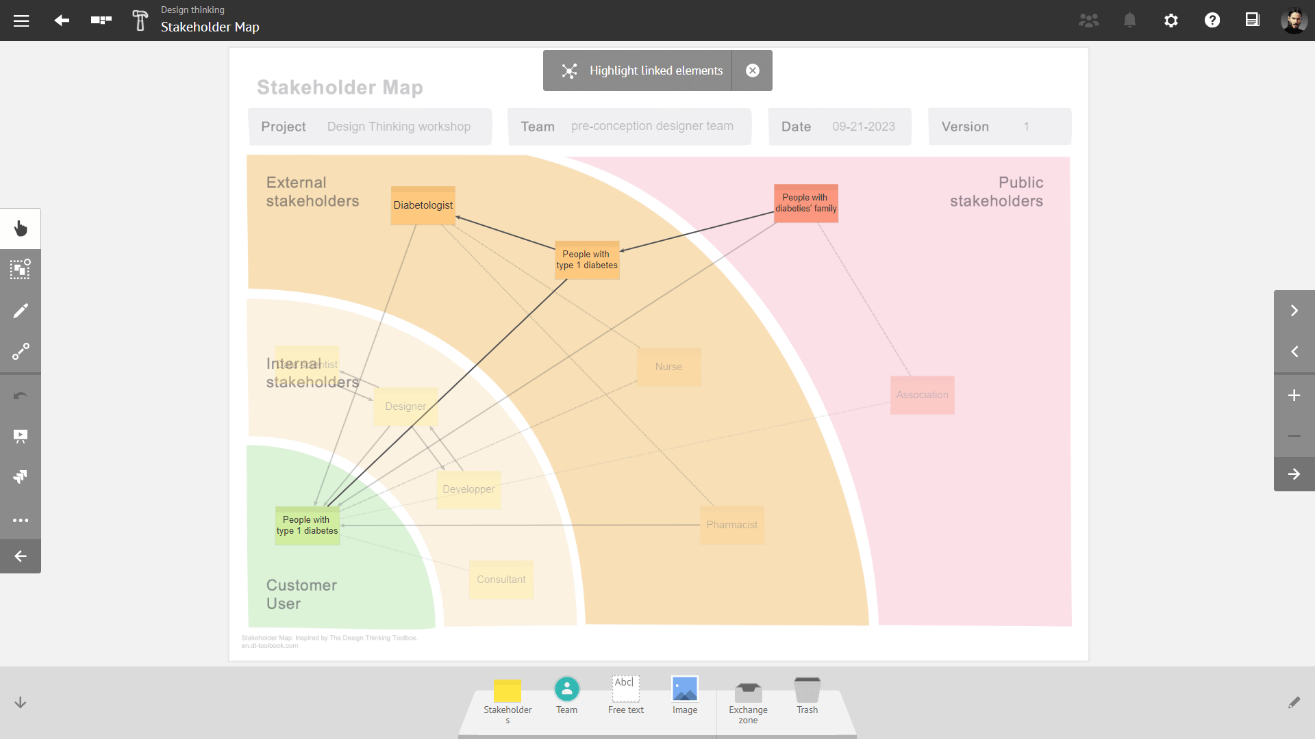
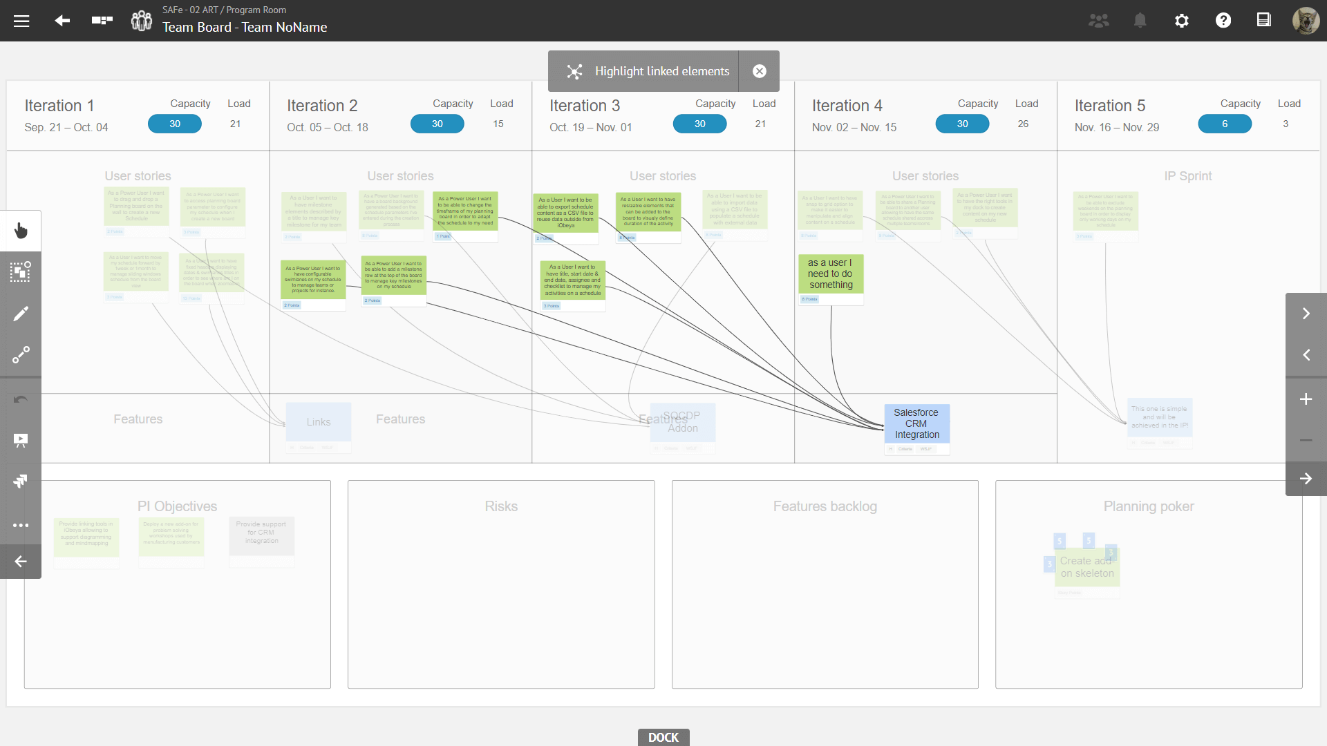
Focus on direct dependencies by highlighting elements directly linked to your cards & notes
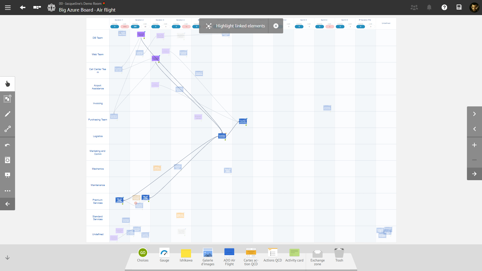
Navigating through numerous elements and their interconnections on your board, especially during a PI (Program Increment) planning with many cards, can be challenging. We understand the importance of swiftly locating a specific card during meetings. To address this, we’ve introduced a new functionality that allows you to focus on a particular card or note, and simultaneously identify any linked elements.
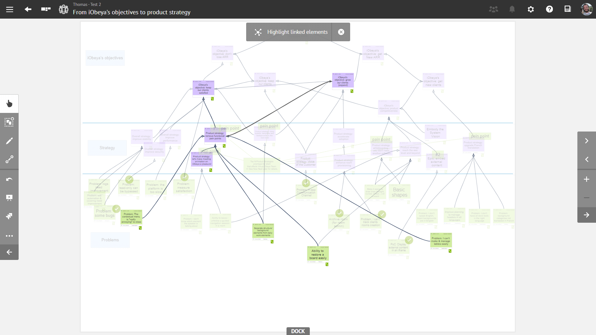
Whether you’re working on a project plan, creating a Work Breakdown Structure (WBS), or reviewing a mindmap, this new feature aims to streamline the process of identifying dependencies between board elements. This evolution will enable you to identify the crtical path in a planning board, offering a comprehensive view of interdependencies.
There are plenty of areas of applications for this new feature, we listed below just a few examples :
- Use it to visualize all dependencies linked to a feature on a Program Board, whether linked to Jira or Azure Devops.
- Identify the impact of ongoing initiatives on your OKR boards.
- Identify synergies between various stakeholders of a new project you want to launch.
- Validate the delivery of a Feature by visualizing the status of required User Stories on a team board.
Welcome Board
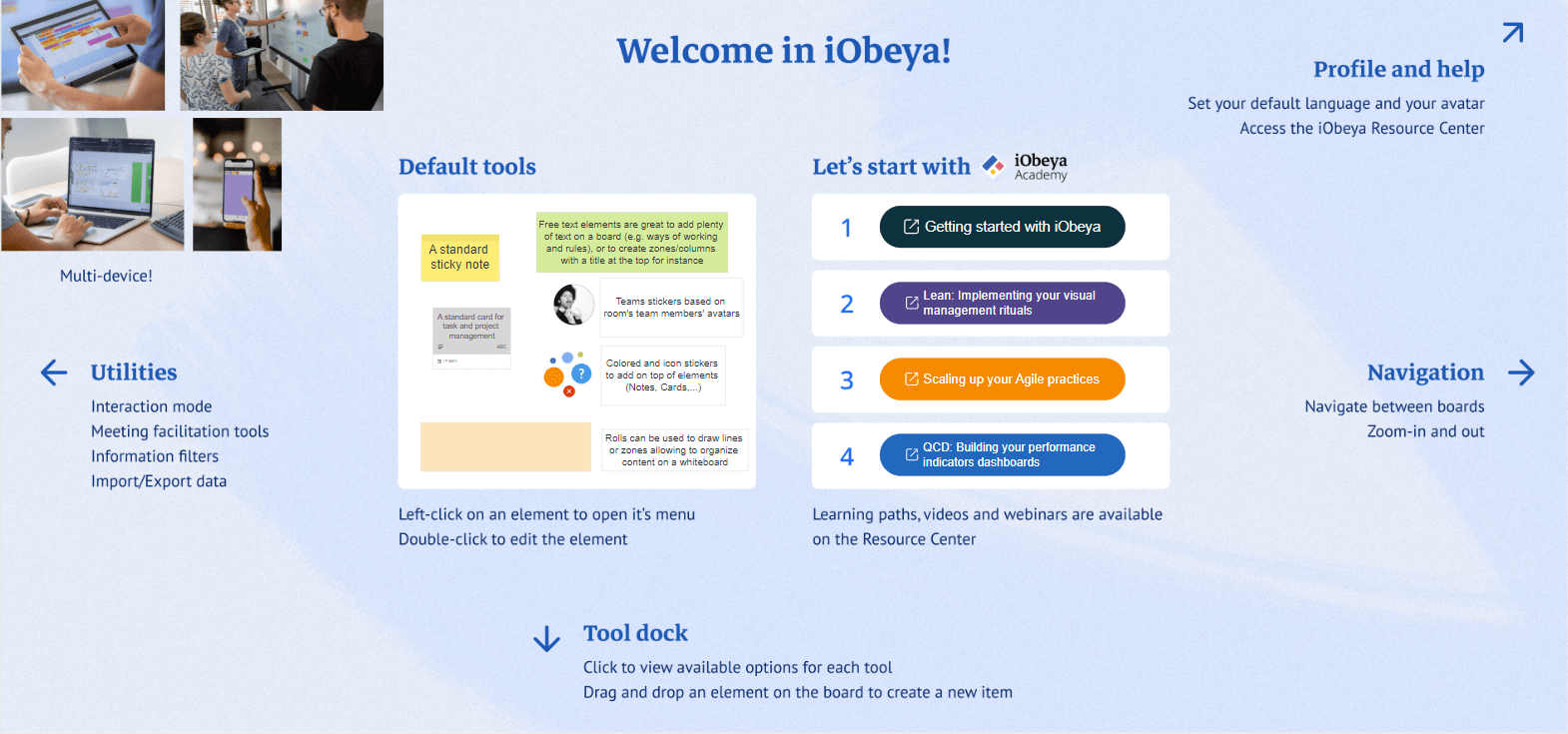
We are embarking on the journey towards a comprehensive onboarding experience seamlessly integrated within iObeya. From this version each newly created room will now feature a default welcome board, thoughtfully designed to lead new iObeya users through the fundamental functionalities within an iObeya room. This board replaces the previously blank default board that greeted users upon room creation.
As users engage with the informative content provided on this board, they will gain a solid grasp of iObeya’s basic features and key user interface elements. Once users feel confident, they can delete the welcome board and replace it with a customized board of their own.
This is a first step of a series of enhancements we’re planning to roll out in upcoming iterations of iObeya. Our overarching goal is to seamlessly introduce in-app onboarding, thereby streamlining the process for new users within your organization to rapidly familiarize themselves and become proficient with iObeya’s capabilities.
Faster board screenshot generation
We’ve made a significant upgrade in how board screenshots are handled. We noticed that waiting times for updated screenshots could be frustratingly long. Previously, the time it took to update screenshots could vary widely, from minutes to even hours, based on board complexity and platform activity.
Our goal is clear: to provide you with an average waiting time of just 5 minutes for generating screenshots. Through meticulous optimizations, we have achieved remarkable efficiency gains of up to 90% in the time taken to generate screenshots for some QCD boards for instance.
Not stopping there, we have implemented a new innovative queue management strategy to manage board screenshots. This approach intelligently prioritizes faster boards, ensuring they are processed swiftly. Simultaneously, boards that require more time due to complexity are managed separately, allowing parallel processing without bottlenecks.
Thanks to our upgraded board screenshot strategy, using board previews for creating dashboards just got more efficient. Now, board previews update within minutes, offering clear visibility into shared data across different boards and rooms. If you found it cumbersome before, it’s definitely worth another shot now!
These enhancements make sure your visual workspace is always up-to-date, providing you a real-time hub for your team’s success.
New Password encryption algorithm
In our ongoing commitment to ensure your online security, we have enhanced password protection by implementing a new highly secure and robust encryption algorithm. This update ensures that your login credentials are stored with the highest level of protection, giving you peace of mind when sharing information while using iObeya.
Please note that this change only applies to local iObeya accounts. Users who log in through single sign-on (SSO) with their corporate accounts are not affected, as their passwords are not managed by iObeya.
To fully benefit from this enhanced security, we encourage users with local iObeya accounts to proactively change their passwords in the coming days. While your current password remains secure, renewing it will migrate it to a stronger encryption algorithm with increased resilience against potential threats.
Although this step is currently optional, we strongly encourage you to make this change promptly. In a future iObeya version, we will require password changes upon login to enhance the security of local accounts that have not been migrated.
New call to action in room archive warning message
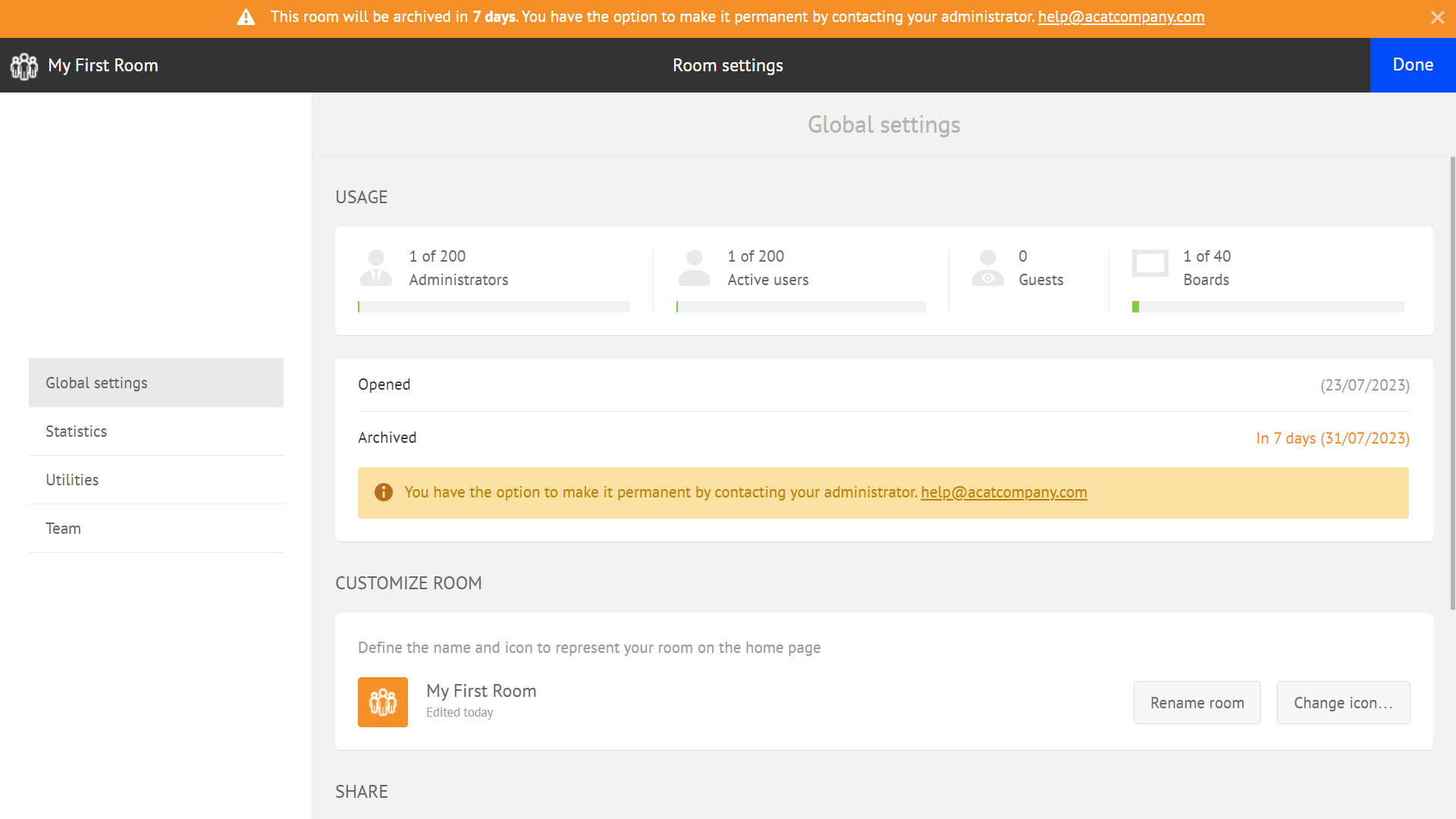
We’ve enhanced the room archive warning message with a call to action allowing room administrators to have access to a dedicated contact email address for each domain on the platform. The contact for each domain can be configured by the platform administrators, enabling seamless communication with the domain administrators when using iObeya rooms in self-service mode.
The call to action prompts room administrators to request to extend the room or make it permanent before archiving. This information is permanently available in the room settings and will be displayed in the top bar for room administrators 15 days before the room’s scheduled archive date.
Preferred language detection
Recently we discovered that the user interface language detection worked so efficiently in iObeya that users rarely set their preferred language in their profile settings, leading to inconsistencies in the language used for emails, in-app onboarding, and other channels.
To address this, we’ve updated the preferred language detection algorithm to automatically set the user’s preferred language in their profile based on your browser settings. By enhancing the preferred language detection, we’re reinforcing our commitment to providing a localized experience for all users.
Users can expect seamless language consistency, improving overall usability and engagement across various touchpoints, including in-app interfaces, email notifications, and the mobile application.
With these improvements, we’re not only streamlining the user experience but also fostering a sense of inclusivity and accessibility.
iObeya in Polish
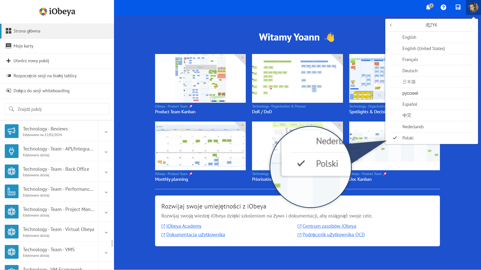
iObeya is available in 9 languages! We are delighted to announce that Polish language has now been added to the list with this new version.
Both end user and administration interfaces have been fully localized and are now available in French, English, German, Japanese, Chinese, Spanish, Russian, Dutch and Polish.
We would greatly appreciate feedback and suggestions you might have on the way the application has been translated. If you notice any inaccuracies or areas that could be improved, please do not hesitate to reach out to us at support@iobeya.com by providing alternative suggestions and screen captures of the application to help us better understand and address any translation issues.
Unleash your productivity with keyboard shortcuts
Originally tailored for large interactive displays used in meeting rooms, iObeya’s usage has evolved to accommodate diverse workflows. iObeya continues to adapt to changing work dynamics, offering intuitive solutions for modern collaborative environments, with an emphasis on enhancing user comfort and productivity.
Our latest updates bring significant enhancements to user productivity and comfort with mouse interactions and keyboard shortcuts that have been refined, allowing for smoother navigation and actions within the platform.
Notably, you can now easily delete elements on any board with the Delete key and utilize Ctrl + C / Ctrl + V shortcuts for efficient content copying and pasting between boards and rooms, whether clicking on a single board element or using the multiple selection to select multiple elements.
New mouse cursors for each interaction mode
We are constantly striving to provide you with a better experience when interacting with boards and elements. To improve the application’s usability, we have revised the mouse cursors for each available interaction mode on the board.
These intuitive cursors ensure you always know which mode is active. This includes various interaction modes such as hand mode for panning around the board, inking and link mode, and multiple selection, as well as other specific actions like rotating and resizing elements.
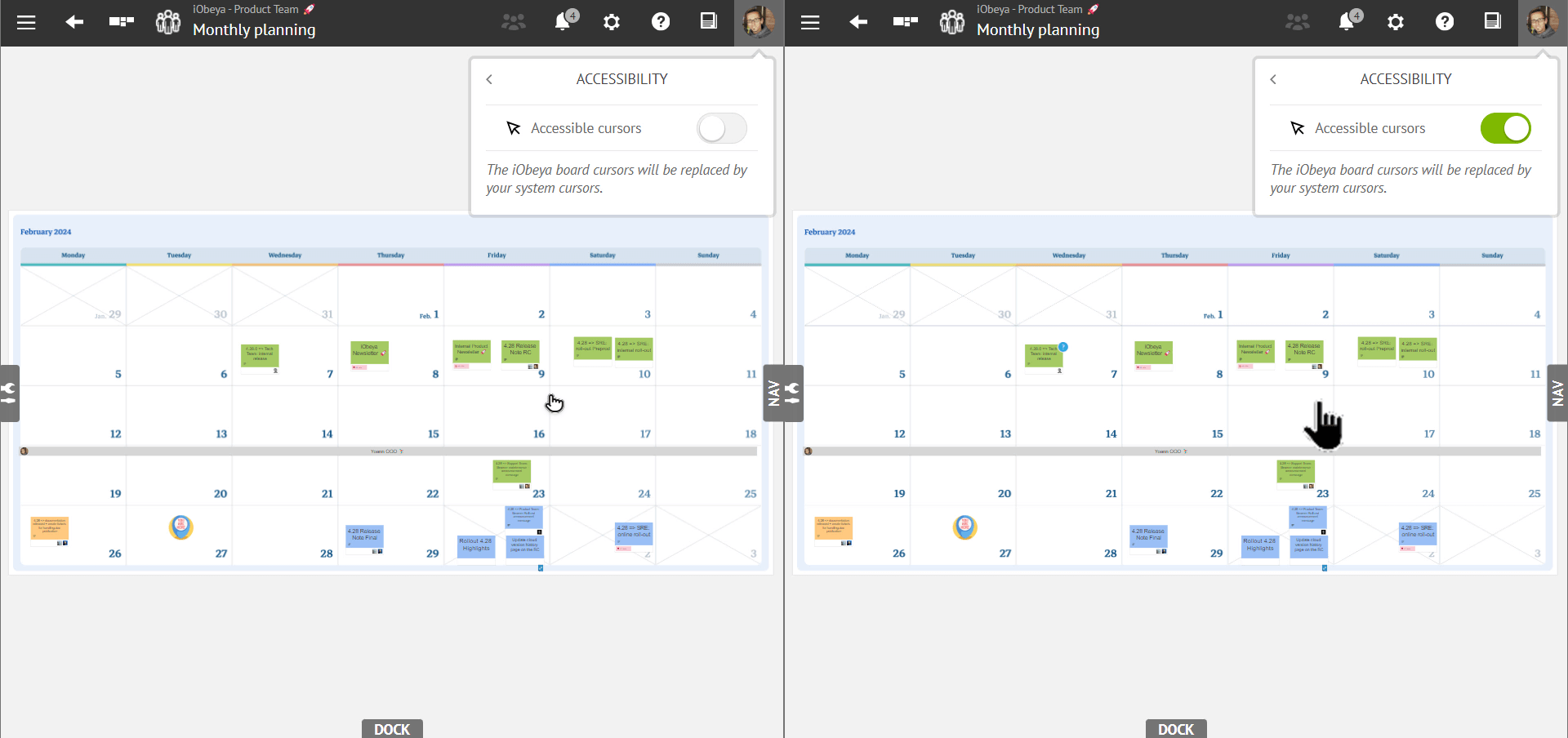
Furthermore, we acknowledge that some users may need accessibility accommodations, such as the ability to adjust cursor settings on their PC for enhanced visibility, including customization of the size and color.
By default, you will have our customized cursors when using iObeya. However, you now have the option to enable “Accessible cursors” allowing you to utilize personalized cursor settings based on your operating system’s preferences.
The scroll indicator becomes a scroller in iObeya
Based on the feedback received through in-app surveys and user interviews, we realized that the scroll indicator could be further optimized for ease of use. In response, we have transformed the scroll indicator into a versatile scroller that adapts to your preferred interactions.
Now, you have multiple options to navigate through lists:
- Click and drag the scroll indicator to scroll through the list just like a traditional scroll bar.
- Use a pan gesture on touch screens, or trackpads, to smoothly navigate the list.
- Continue using your mouse wheel for scrolling, just as you are accustomed to.
We believe this enhancement will significantly improve your experience with lists in iObeya, eliminating any interaction issues you might have encountered.
Performance Management
Pareto Chart for QCD Actions
The law of Pareto says that 80% of issues stem from 20% of causes. Addressing this critical 20% can yield significant improvements in problem-solving and overall performance.
In the realm of performance management with QCD, our users utilize QCD cards to record problems and characterize them with various details, such as categorization, priority, criticality level, reporter and ownership identity for resolution.
Given the multitude of actions generated daily, prioritization becomes key. Users need to identify the 20% of actions that will address 80% of the problems effectively. Imagine instigating this prioritization process at the ground level—production lines on a shop floor, safety managers, shopfloor managers, and upper management actively engaging with and prioritizing issues within their Obeyas.
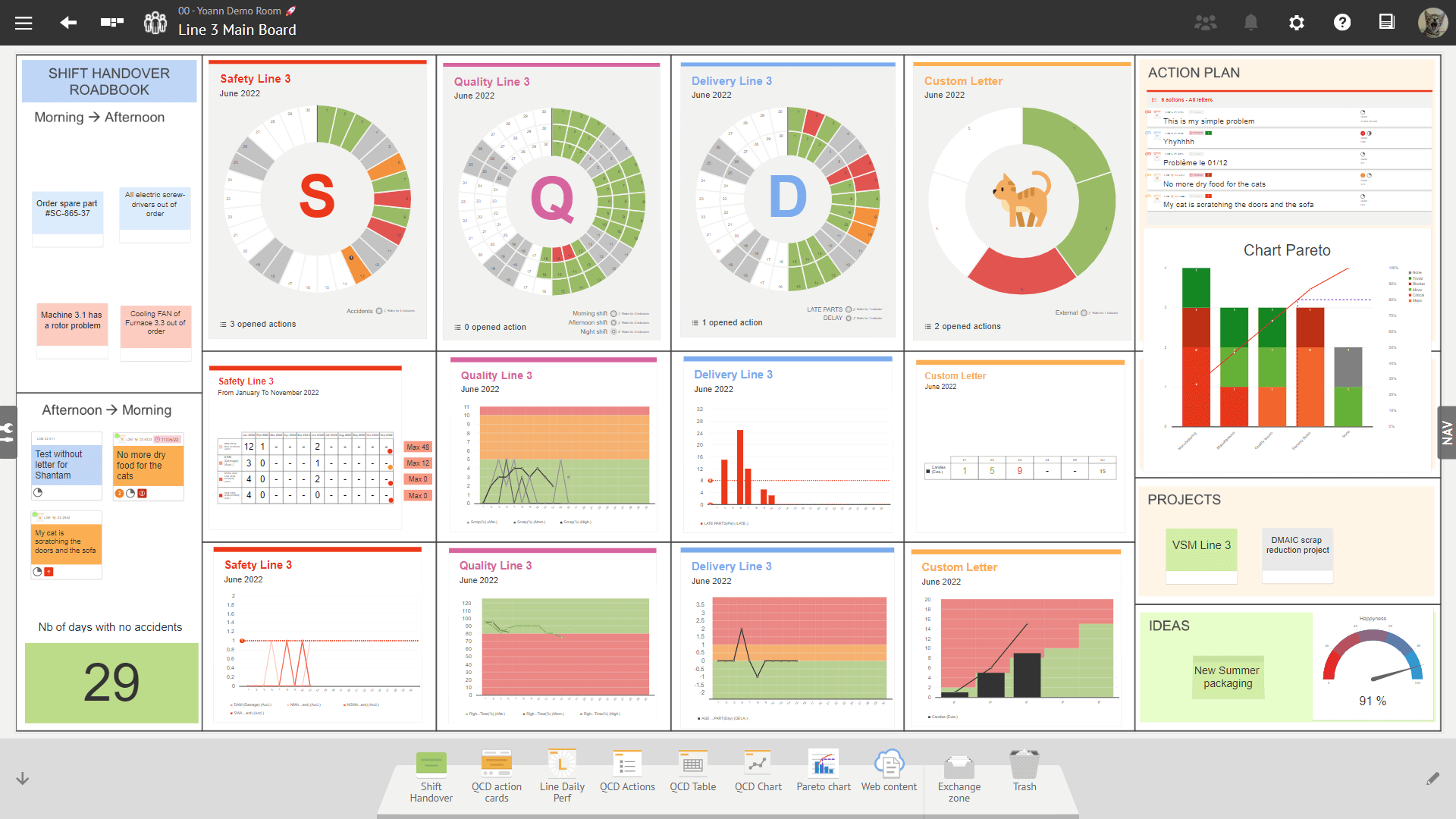
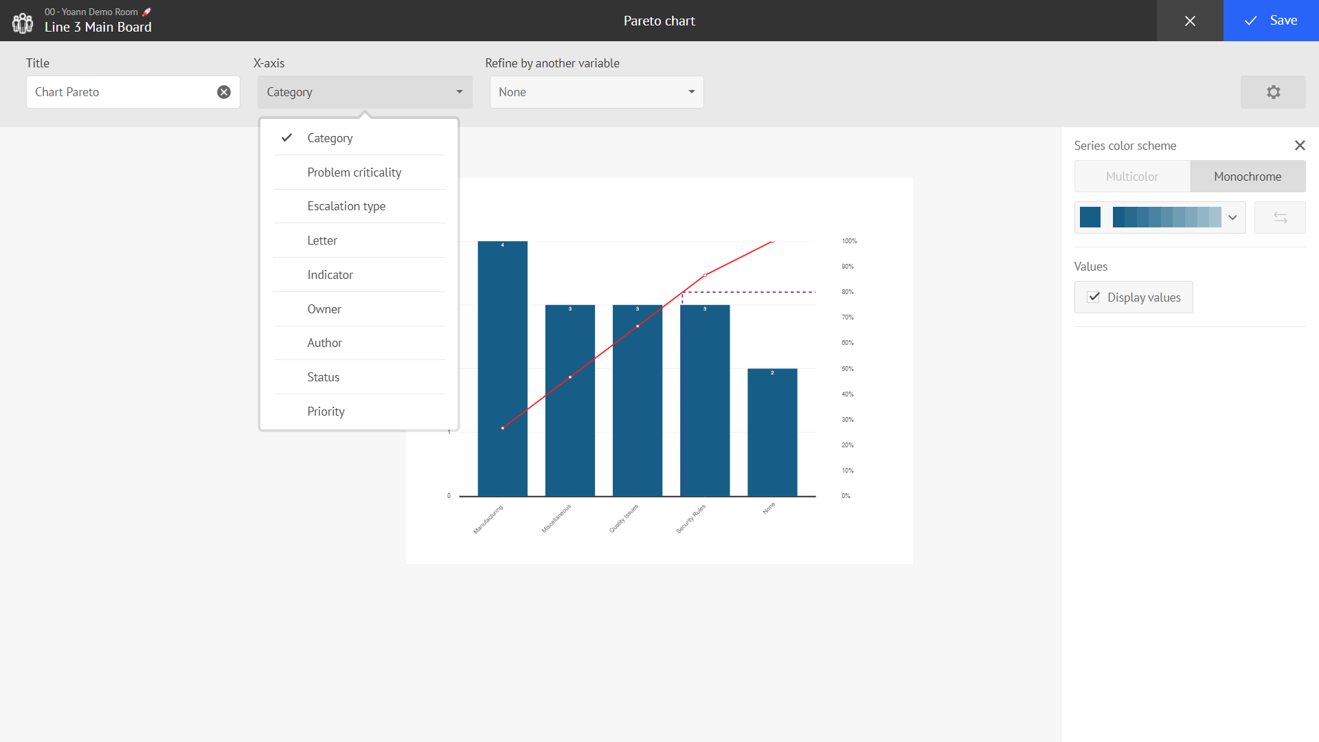
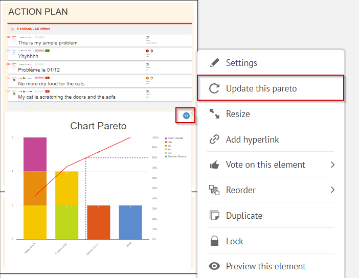
To create such a dynamic and to give our users the ability to achieve the aforementioned results, we have introduced a new QCD tool called “Pareto chart”. This tool is available in the iObeya QCD tool catalogue from where you can add it to your QCD boards tool dock. For starters, this chart is directly linked to all the QCD actions of the board where it is added, whether escalated, linked with/without a letter or just present as a QCD card on the board.
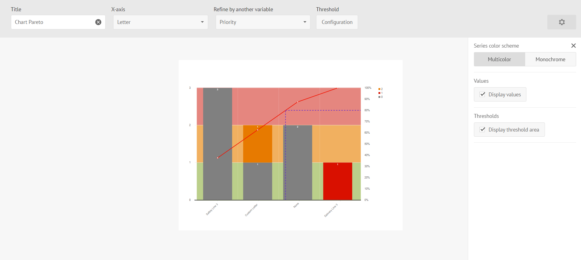
You will be able to configure the Pareto chart X-axis with different criteria, which are the same as the ones available in QCD action plan filters. For further analysis, you can break down the bars into stacked bars via a 2nd parameter giving you the ability to refine your Pareto analysis more!
We have added the notion of thresholds to the Pareto chart. You can now define QCD action thresholds that will add colored background (green, orange, red) to the Pareto chart. The idea is to give you a clearer picture of the number of actions you have on your board so that you can manage them efficiently when they exceed the thresholds you defined accordingly.
This approach fosters local problem-solving initiatives and allows teams to make informed decisions during their daily routines, boosting efficiency and collaboration.
This is just the first step in a series of improvements that we will be making to this essential tool of performance management in the coming versions. For example, we are already working hard adding the ability to use Pareto across multiple boards in the same room, and we are looking forward to suggestions from you on how we can improve Pareto respond to your QCD usage!
Results-driven and efficient problem-solving with QCD
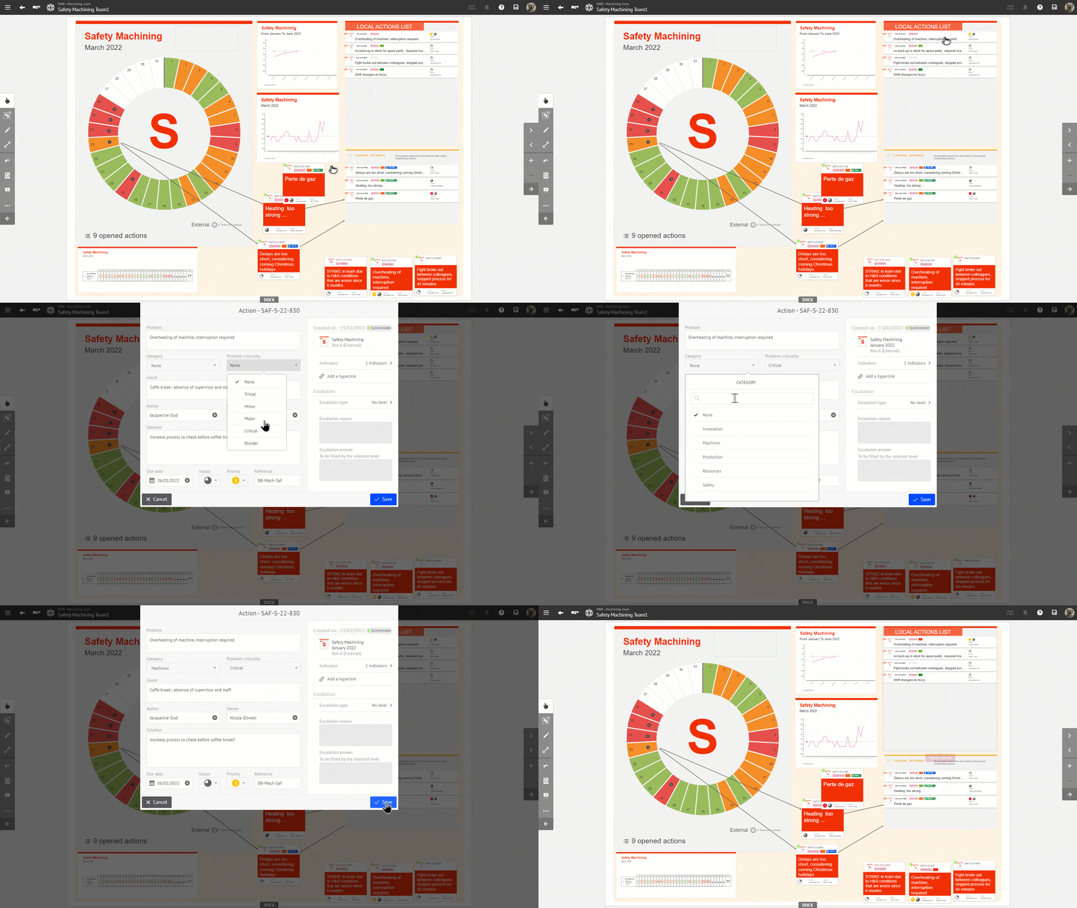
One other notable improvement is the introduction of a new behavior on the QCD action tables. Previously, accessing detailed information or editing actions listed on these tables required a cumbersome process of double-clicking to navigate to the action plan view. Now, users can seamlessly open the editor of an action directly from any iObeya board by simply double-clicking on the desired action listed in the action table. This enhancement not only simplifies the workflow but also enhances user productivity and comfort within the platform.
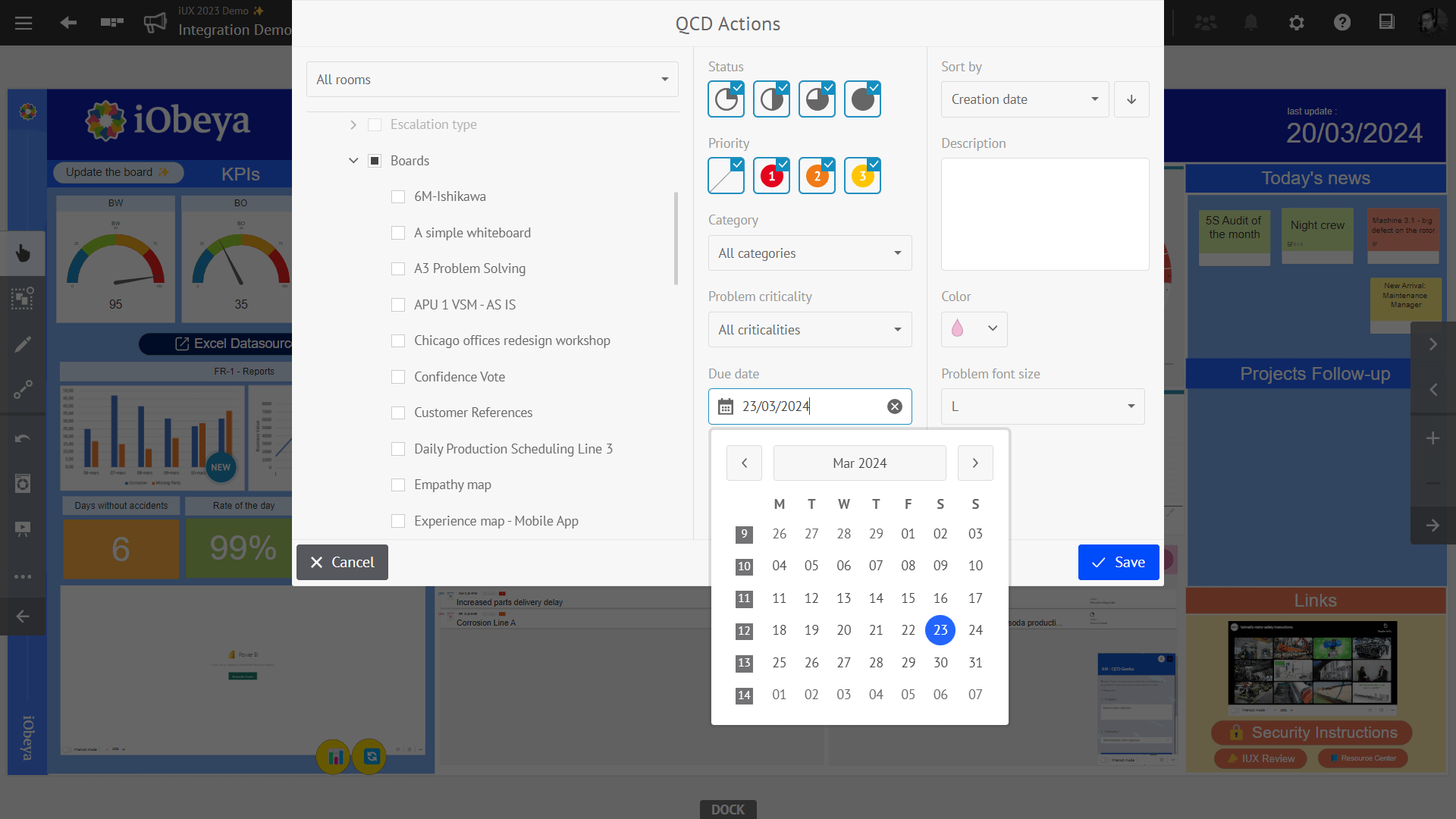
Furthermore, we’ve incorporated a due date filter into both the action table and the action plan views. This practical addition enables users to efficiently sort and review actions based on specific due dates, promoting better organization and task management.
Ability to pause tasks on Daily Capacity Management (DCM) boards
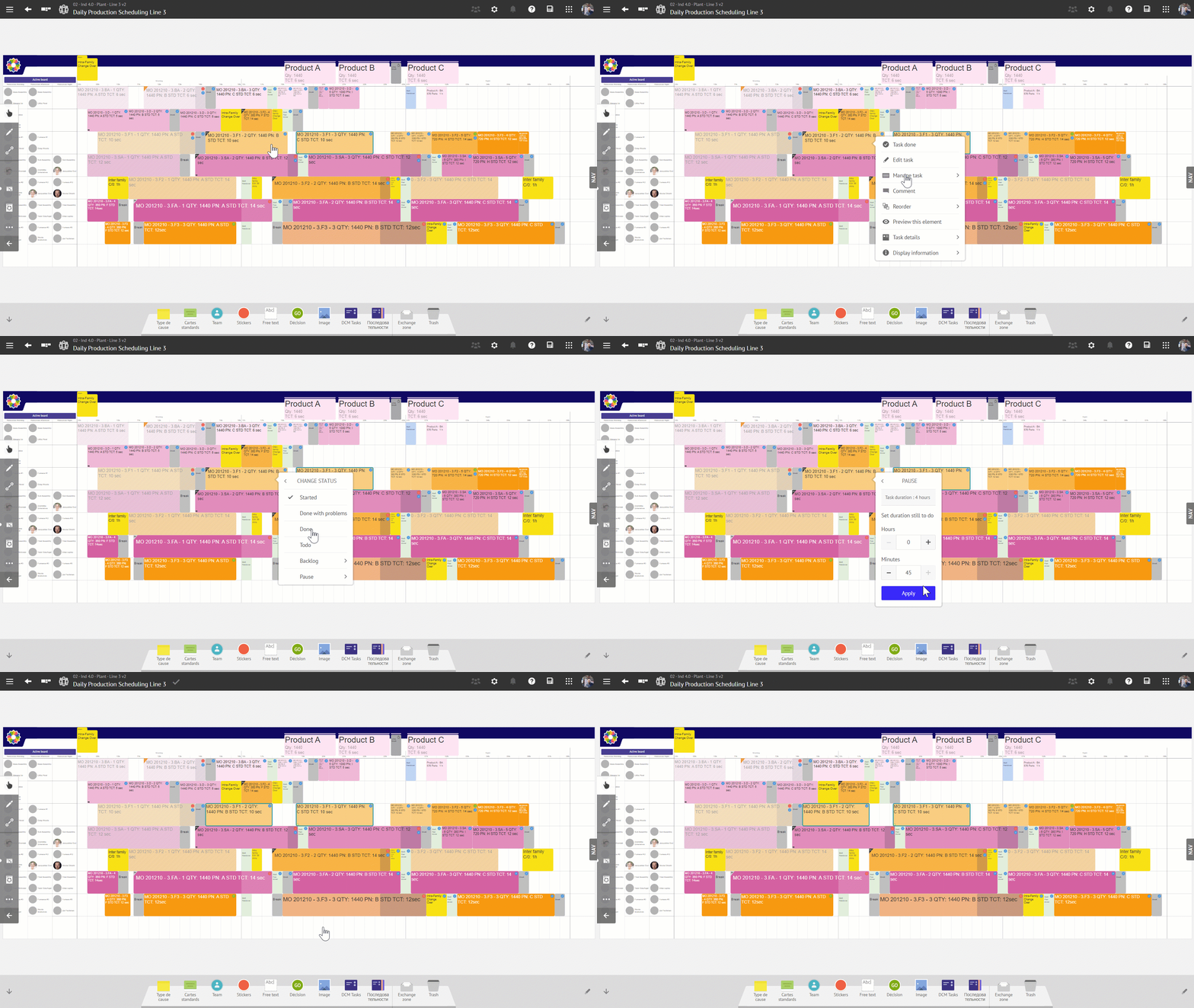
With this new version of iObeya, we have introduced a new possibility in DCM, the ability to interrupt or put on pause a specific task.
During a normal production day followed in DCM planning it might happen that a certain task needs to be interrupted at a given time to start certain other tasks, or for a break or pause for the person in charge of the task. This operational reality poses challenges when it comes to organizing and precisely tracking the progress of tasks. As tasks may be planned long-term and will be divided over time, the users need to have the possibility to divide their tasks into multiple parts (knowing that it is the same task in its continuity) without distorting the DCM KPIs.
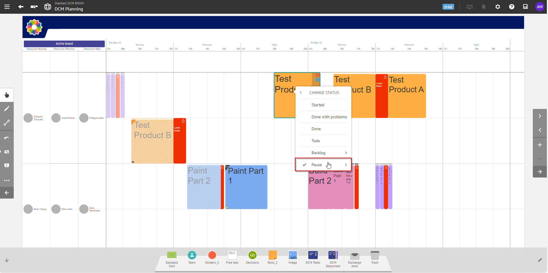
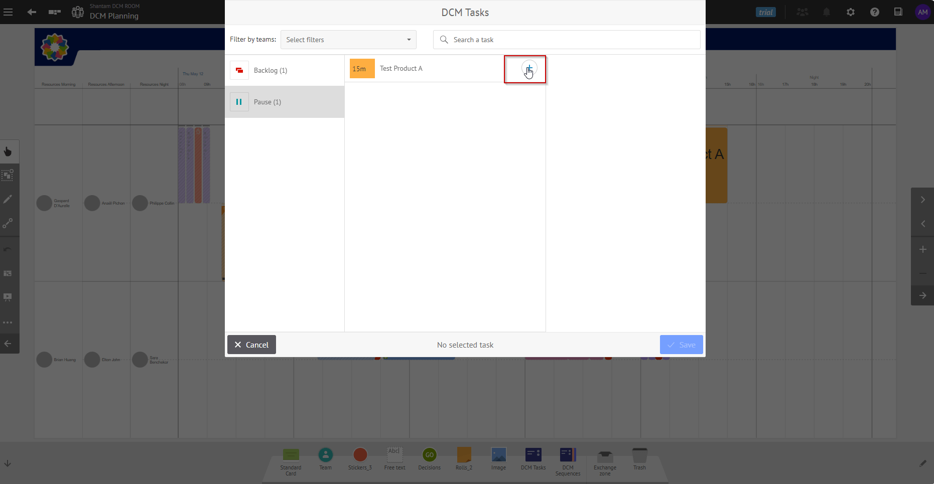
For these reasons, DCM users will now be able to use a new status “Pause” for their tasks indicating that the task has been paused with the desired remaining duration. They will be able to reschedule the remaining part of the task in a DCM planning board via the DCM task catalogue with a process similar to the tasks sent to the backlog The part of the task that is left on the board is marked as done and the DCM KPIs are updated accordingly.
We’ve also implemented in the latest version of iObeya automatic resizing of DCM tasks when they are paused. This provides a real-time visual indicator of the state of your tasks, ensuring clarity and coherence on your DCM board.
This behavior has also been implemented for DCM tasks that are started and then sent to the backlog.
Drag and drop new DCM tasks onto the board
We have introduced a change in how you can create your DCM tasks on a board. From the tool dock, you can now drag and drop the DCM task icon onto the exact area on the board where you want to add a new task, and then choose the task from the catalog.
We have conserved the original behavior of clicking on the DCM task in the tool dock allowing you adding multiple tasks on the DCM board.
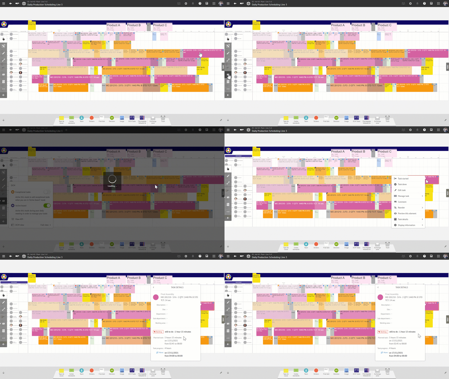
Managing Tasks exceeding DCM board time range
Previously, when a DCM task’s size exceeded the date range on a DCM board in “Design Board” mode, after switching the board to “Active Mode,” the task would automatically shift left, causing a pile-up of tasks. This had to be manually corrected, which was a tedious operation that could lead to inconsistencies with your DCM KPIs.
Now, any part of a task that exceeds the date range will automatically move into the backlog while keeping the information of the original task. This improvement ensures you have all necessary information at hand, such as the name and remaining time for completion, allowing for easier task management and planning.
Define context for your DCM tasks
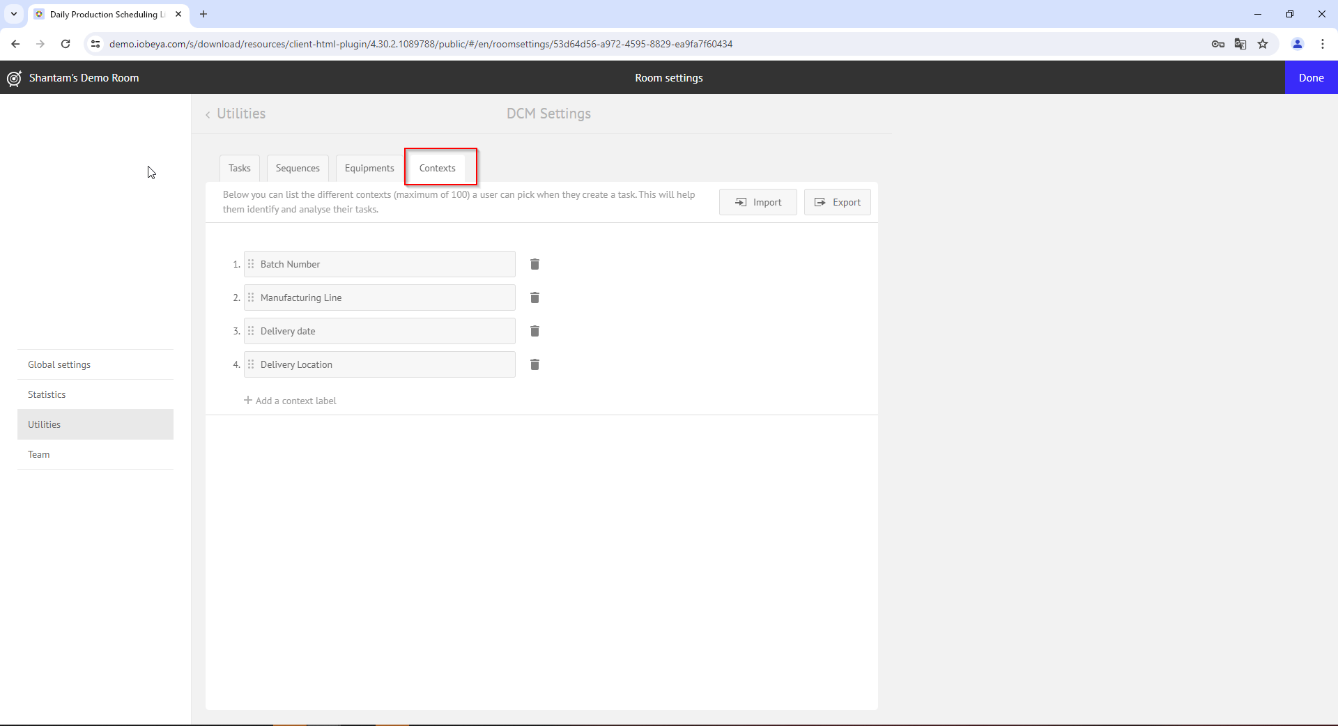
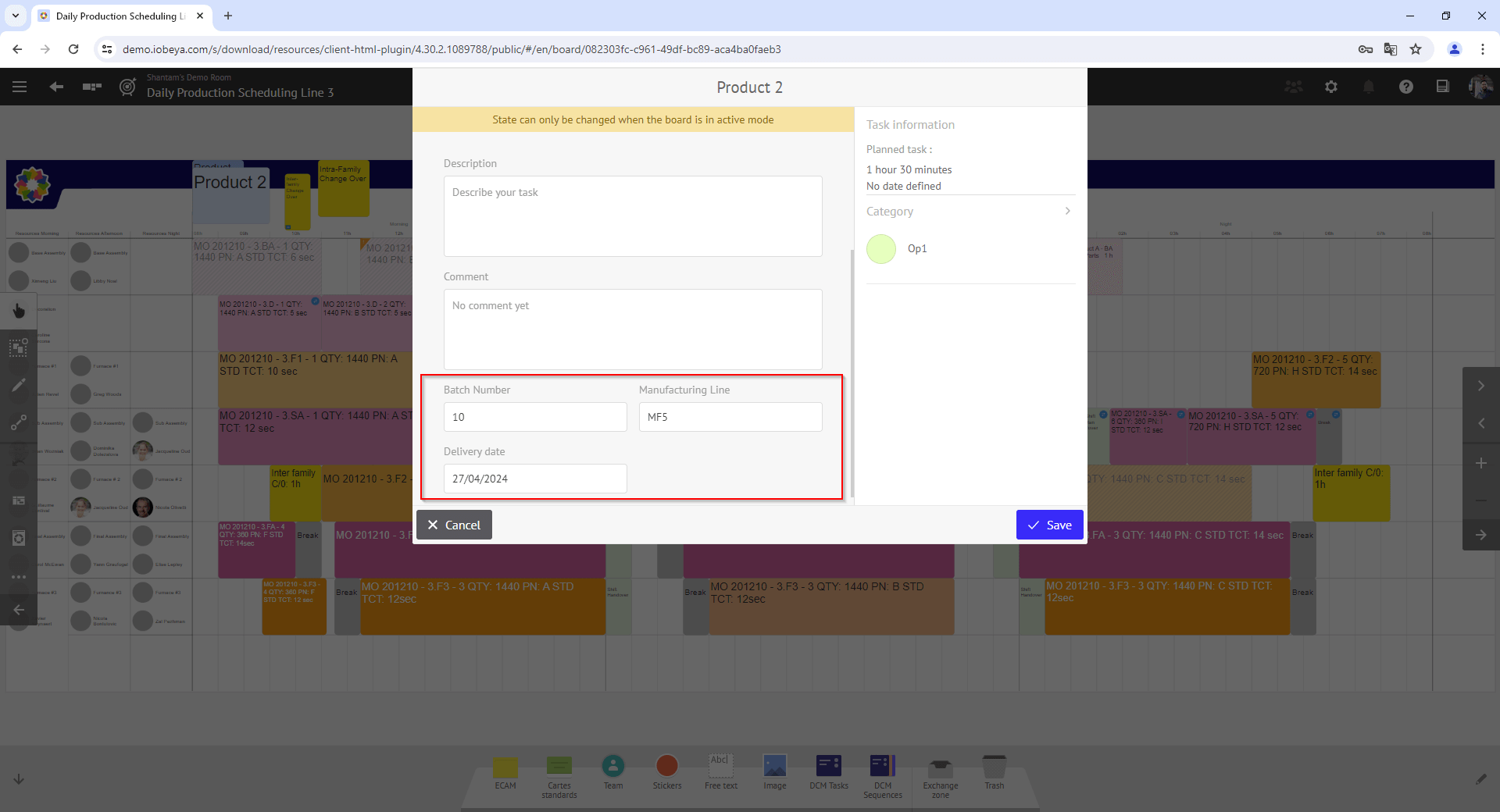
We’ve added new customizable fields in DCM Utilities, allowing you to add extra information to your DCM tasks. These fields can be configured via the “Context” tab in the DCM utility configuration available in your room settings.
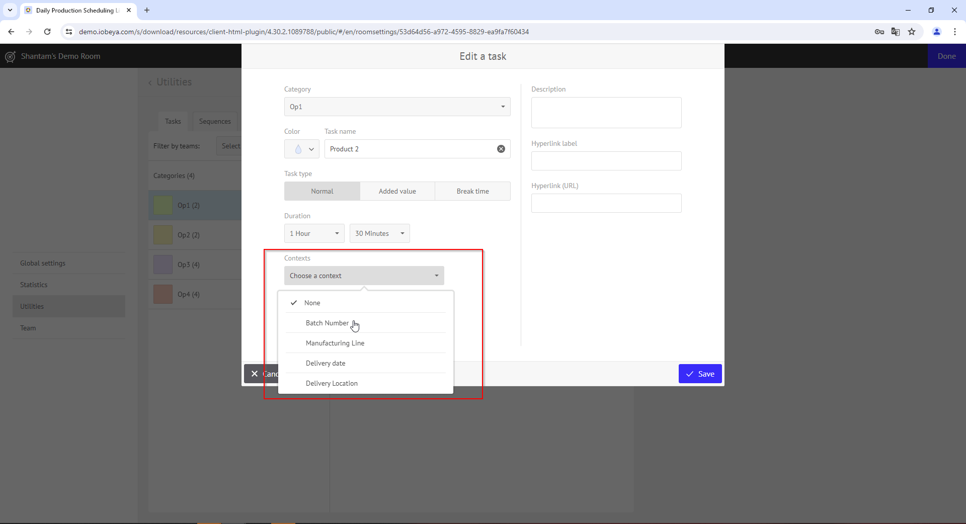
Once configured, you can edit DCM tasks that will be available in the catalog and individually set up which extra fields you want to add for each type of task.
Once set, these fields appear in the task editor, providing text boxes for entering the corresponding value. Please be advised that these extra fields will be available only for new tasks added to your boards and not for existing DCM tasks.
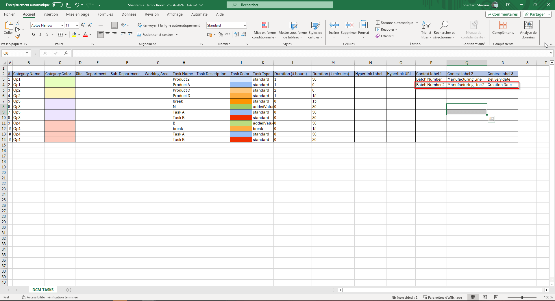
These fields are visible when you export your KPIs in CSV format and can be used to categorize and refine the analysis of your DCM tasks. Inversely, you can also import your pre-configured tasks in CSV format, predefining these extra fields so they appear automatically in your DCM tasks and are ready for use.
Agile@Scale
Edit the configuration of existing Program boards
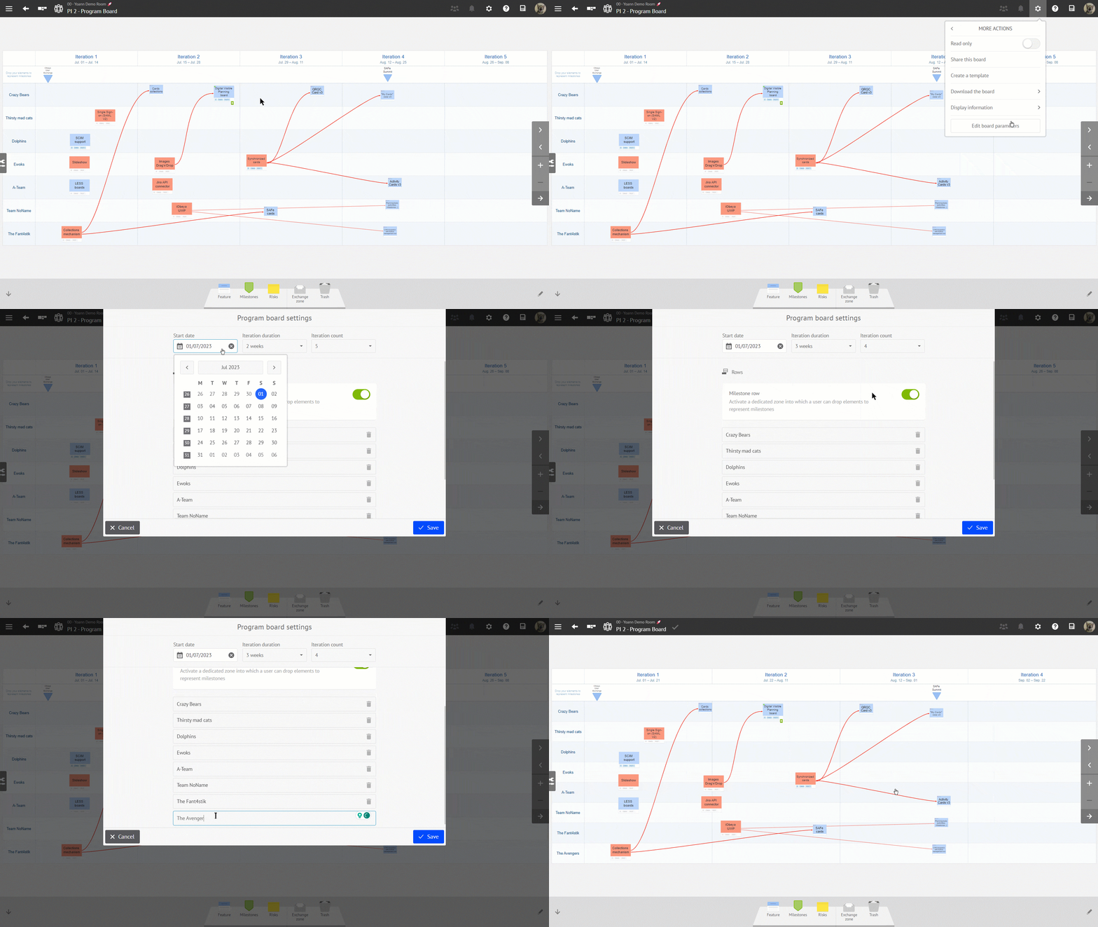
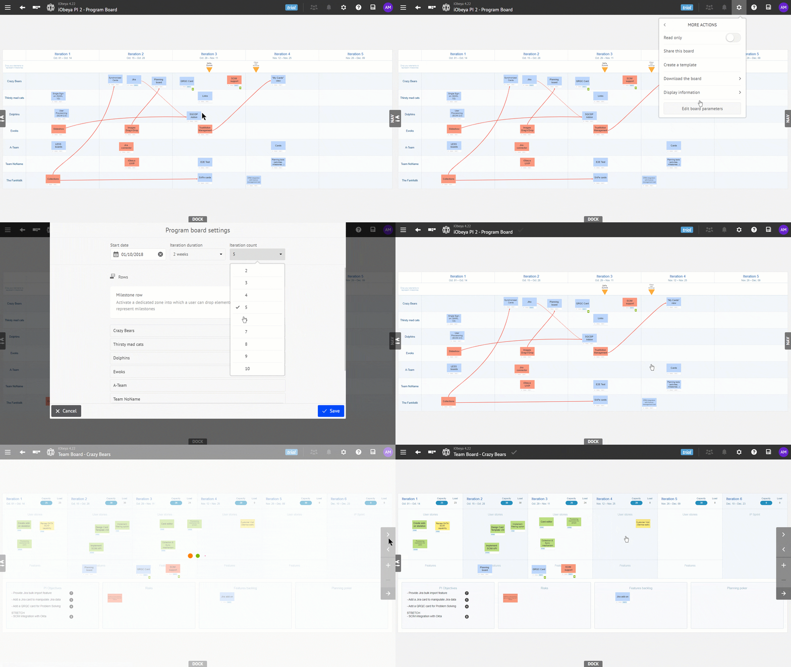
We empower you to reconfigure your existing Program boards to better suit your evolving needs. Whether you want to add more sprints, enable the milestone row, or adjust the program increment start date, you can now modify any configuration parameters on existing Program boards without affecting their content. Your board’s content will remain intact, allowing you to easily adapt it to the new layout without any information loss.
We roll-out the automatic update of associated Team boards when you change your Program Board configuration.
For instance if you change the number of sprints or their duration, the associated Team Boards will be updated accordingly while keeping board’s content intact.
Beware, if you add, remove or rename teams on your Program board, you will still have to manually apply theses changes by adding, renaming or removing the corresponding Team boards in your room.
Combine iObeya Agile cards with Jira or Azure DevOps cards on the Team boards
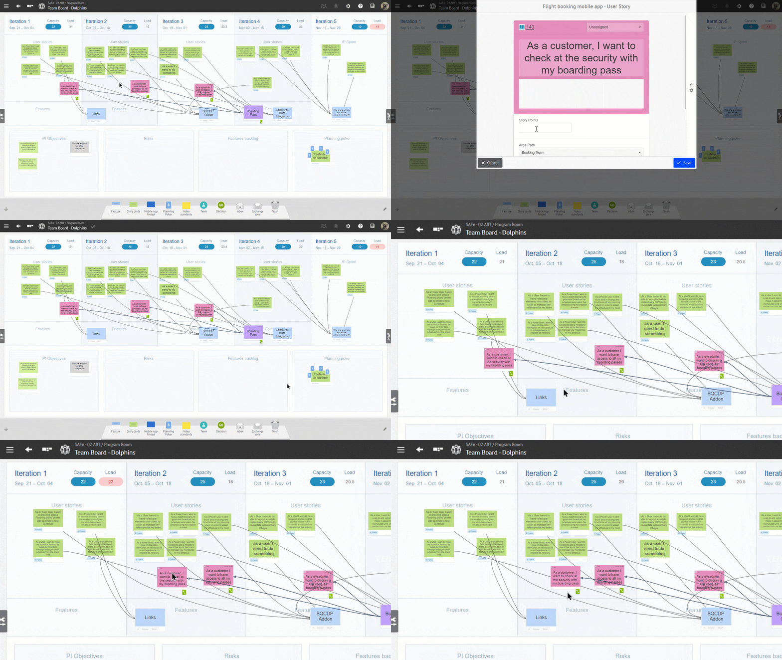
When using a Team board, the calculation of the load for each iteration column now includes story points from Jira and Azure DevOps cards, in addition to the iObeya Story Cards.
The Team board, inspired from the Scaled Agile Framework®, serves as a centralized space for various types of cards, promoting efficiency and providing a convenient platform for team collaboration.
Particularly during Program Increment (PI) planning, when the team is in the process of breaking down features into stories and engages in discussions, it’s crucial to efficiently evaluate the workload before generating additional story cards and reorganizing the work to be delivered across each sprint.
This evolution provides real-time updates, empowering the team to combine both Jira/Azure DevOps cards with iObeya Story cards.
Quickly find and import your Jira data into iObeya
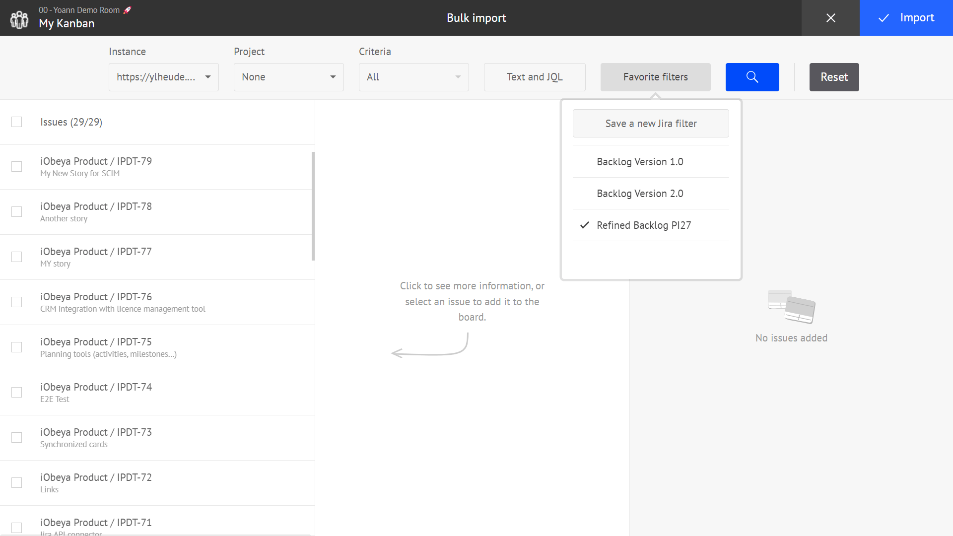
The Jira Favorite Filters are the most frequently used option in the Jira bulk import interface to query and import data from Jira. That’s why we’ve moved the list of favorite filters to a dedicated menu accessible directly from the main Jira import interface.
Through this new menu, you can now save a search made in iObeya as a reusable favorite filter in both iObeya and Jira!
You can also now confirm a text search, or a JQL query by pressing the Enter ⏎ key on your keyboard.
Integration
New page to manage your iObeya-connected applications
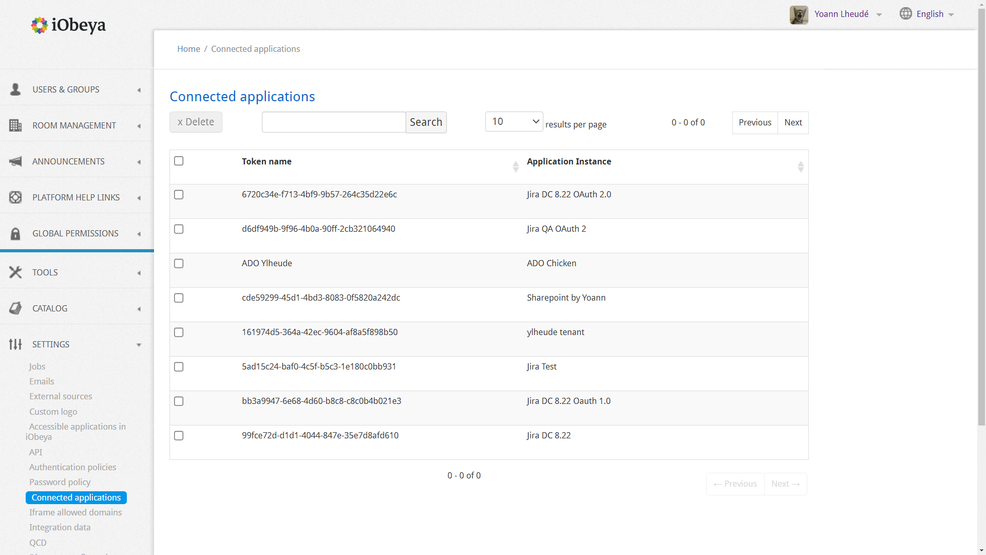
We want to provide you with a simple and transparent way to view all the applications connected to your iObeya account, such as SharePoint, Jira, or Azure DevOps.
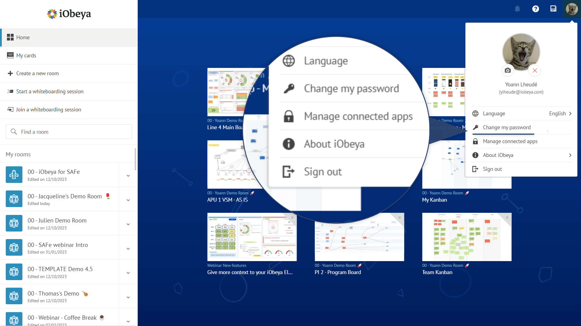
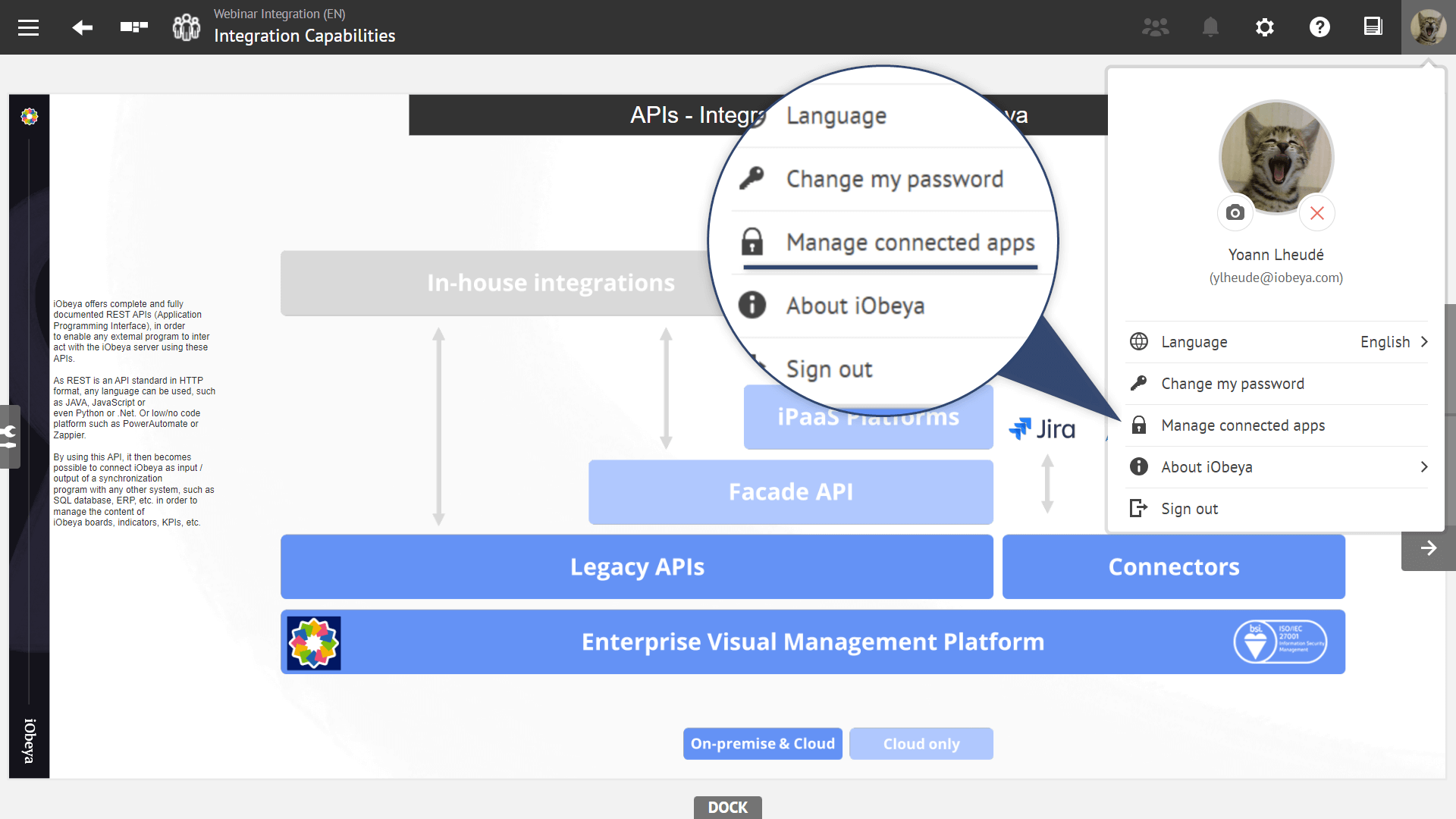
To do this, simply click on your profile icon and navigate directly to the dedicated page Manage connected apps.
On this page you will have the ability to review the complete list of connected applications, along with the names of associated access tokens.
Access tokens are secure keys that ensure unique authentication to external applications by obtaining your permission to access your data. Each token is generated when you first connect to an external application and consent to sharing your access with your iObeya account.
This page also allows you to revoke access to an external application by deleting the corresponding token at any time. You can then reconnect to the external application by re-establishing the connection within your instance.
We have designed this feature with the goal of providing you with complete control over the applications connected to your account while ensuring security and ease of use.
Platform administration
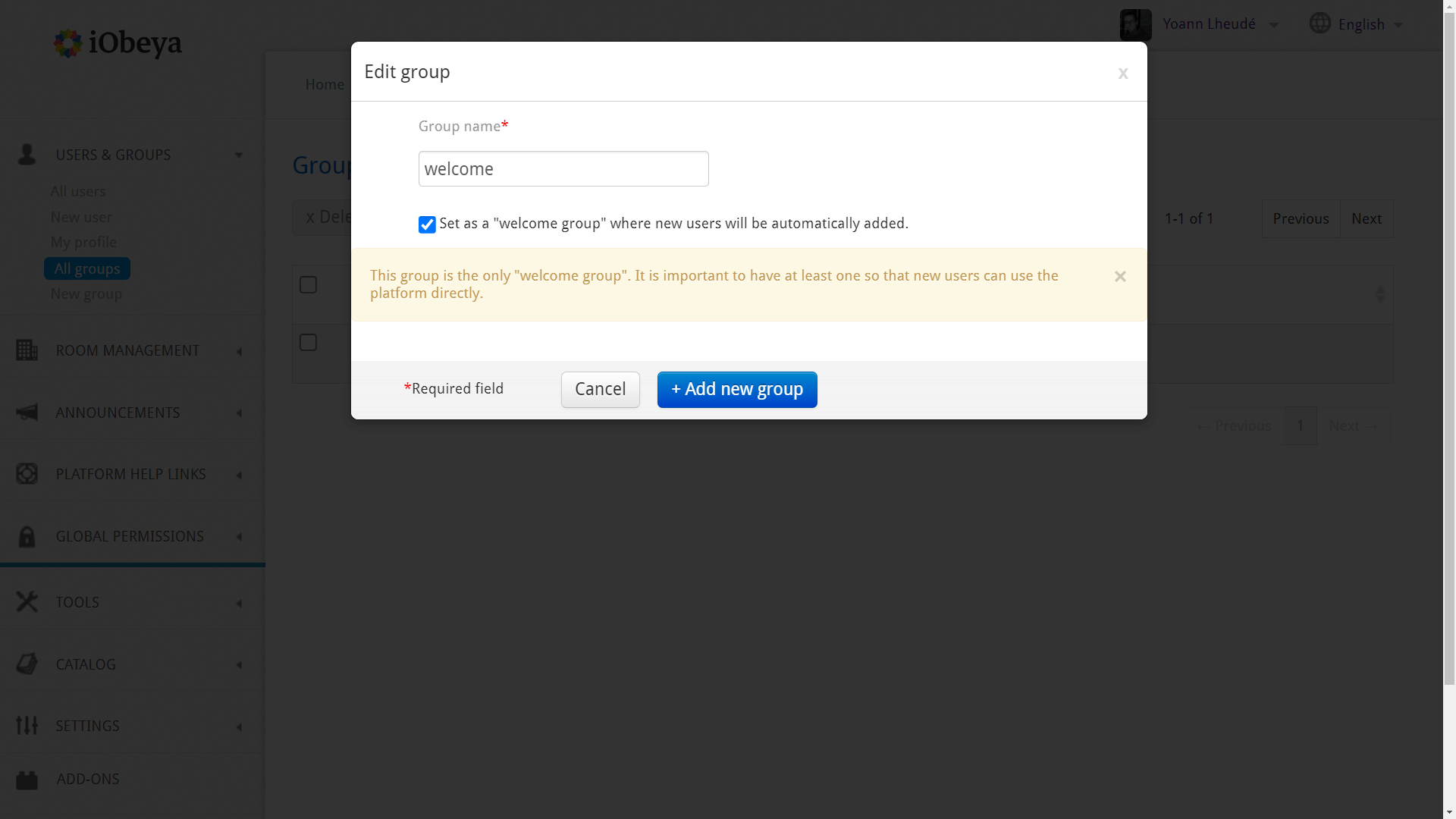
Platform administrators can define welcome groups
As a part of our commitment to provide an enterprise-grade platform that can support collaboration at scale in large organization, we are delighted to introduce welcome groups designed to streamline user management platform-wide.
Platform administrators can now create welcome groups, ensuring that new users automatically inherit permissions defined platform-wide, thereby eliminating the need for manual permissions assignments. Moreover, combined with Single-Sign-On and self-service room management, it allows you to accelerate the solution adoption by making iObeya rooms available to anyone in your organization.
For existing environments, enabling this feature on your existing groups is just one click away. If you need assistance, our consulting team is ready to help you configure a welcome group on a dedicated domain with a dedicated public room to facilitate user onboarding for example.
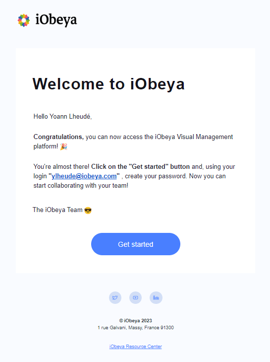
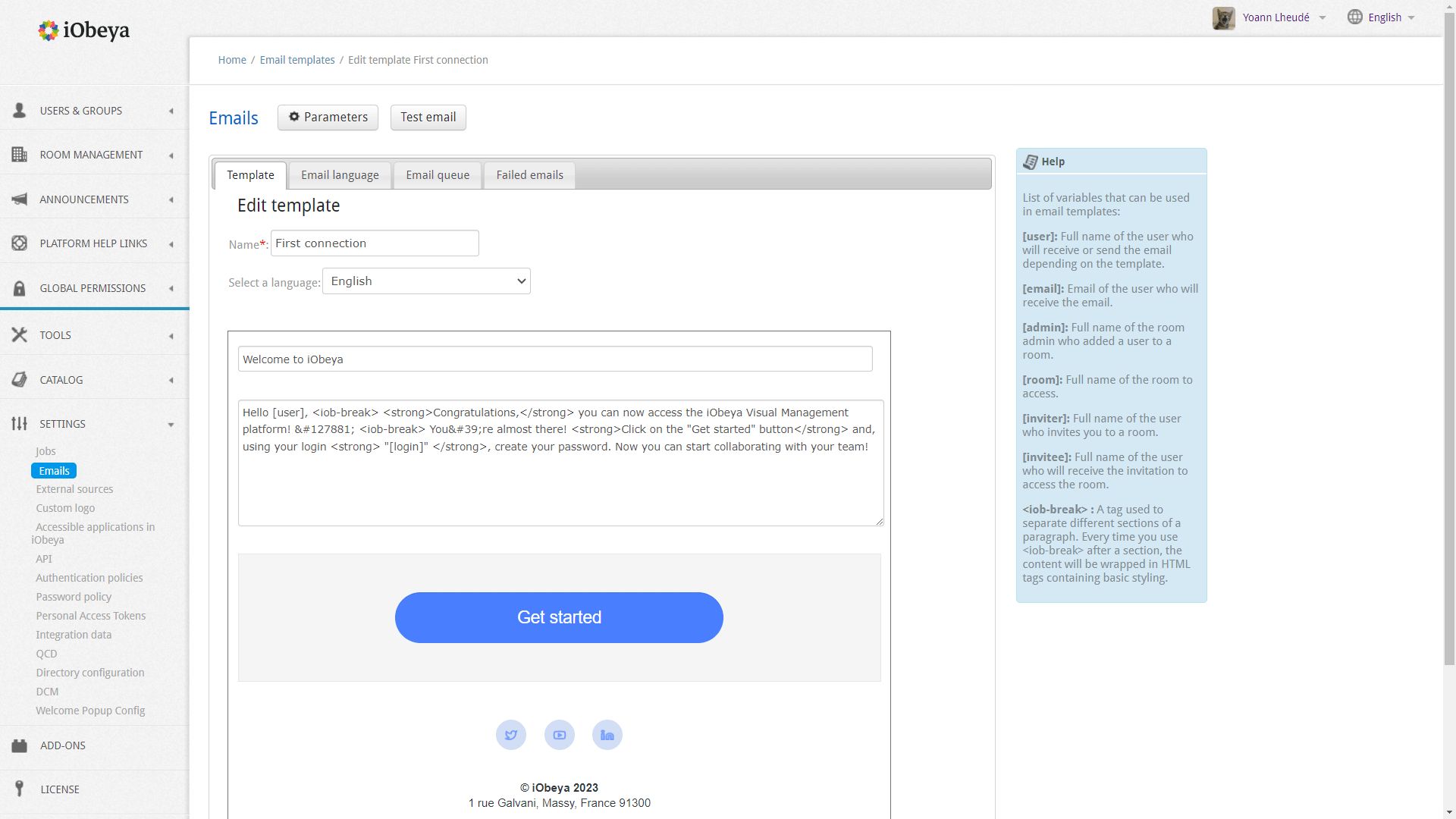
iObeya emails have been refreshed
In version 4.31, we’ve given a fresh new look to the emails sent by iObeya on various occasions, such as password requests and room or whiteboarding session invitations.
For platform administrators who have customized the content of these emails on their platforms, beware that the email content will be exceptionally reset. We recommend checking how the default content fits with your processes so that you can make any necessary adjustments if needed.
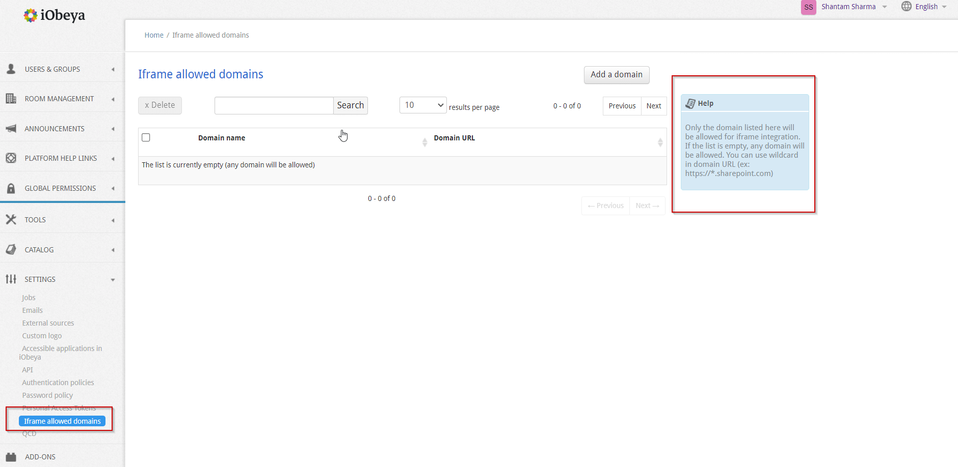
Web content domain whitelisting
The safety and security of your organization’s data comes first. iObeya is ISO27001 certified and to keep our promise of keeping your data safe we have introduced a new domain whitelisting feature available from the platform settings.
By default, iObeya allows embedding external content from any domain or subdomain using the web content tool. This whitelist enables platform administrators to authorize approved websites and applications that can be safely embedded into iObeya boards through the iObeya web content tool.
By configuring a list of authorized URLs and domains, you can now prevent iObeya users from embedding inappropriate, or unauthorized content onto their boards.
Administrators can use wildcard asterisks (*) to authorize multiple subdomains with a single entry (for example, https://*.sharepoint.com will authorize any subdomain on Sharepoint application).
Release notes 4.31 On-premises
To learn more about what changed in iObeya 4.31 on-premises, read the detailed Release notes to get the full list of changes and bug fixes included in this new version.

