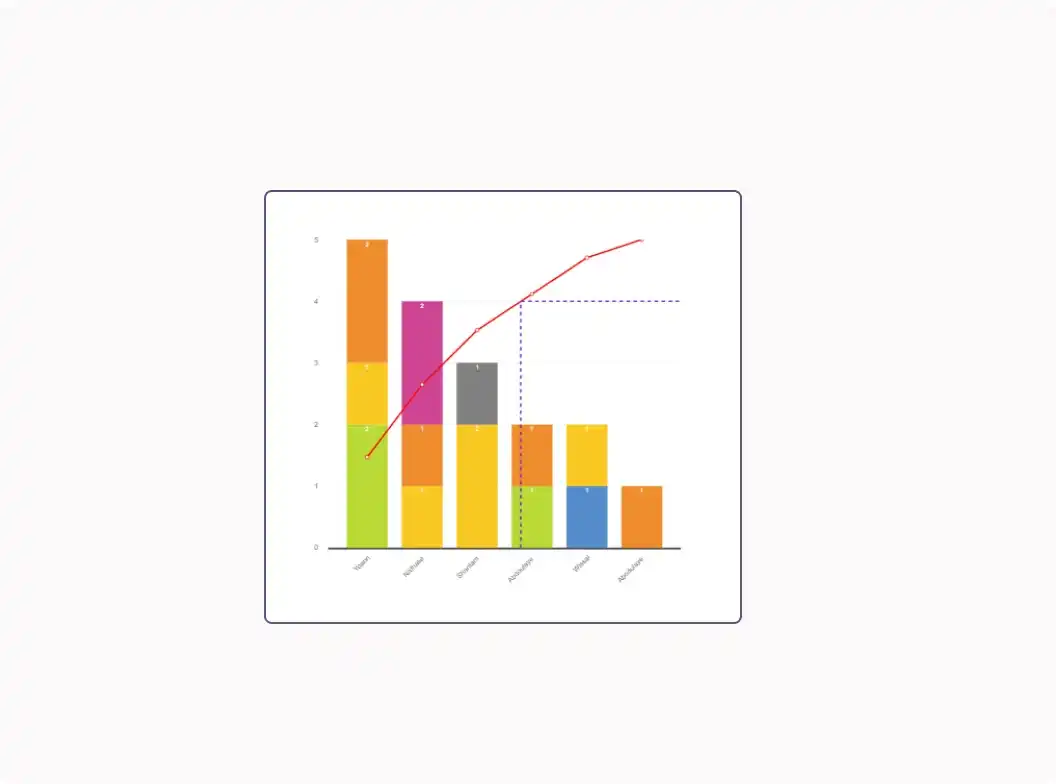
Pareto chart
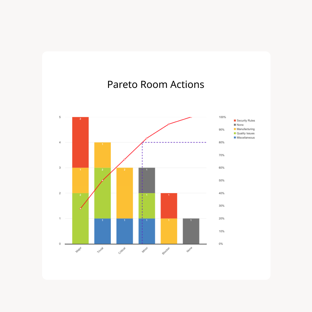
Integrate the Pareto Chart into your problem-solving and analysing efforts. With this tool, you’ll visualize the frequency of your issues by type and prioritize their resolution.
A User-Friendly Graphical Tool
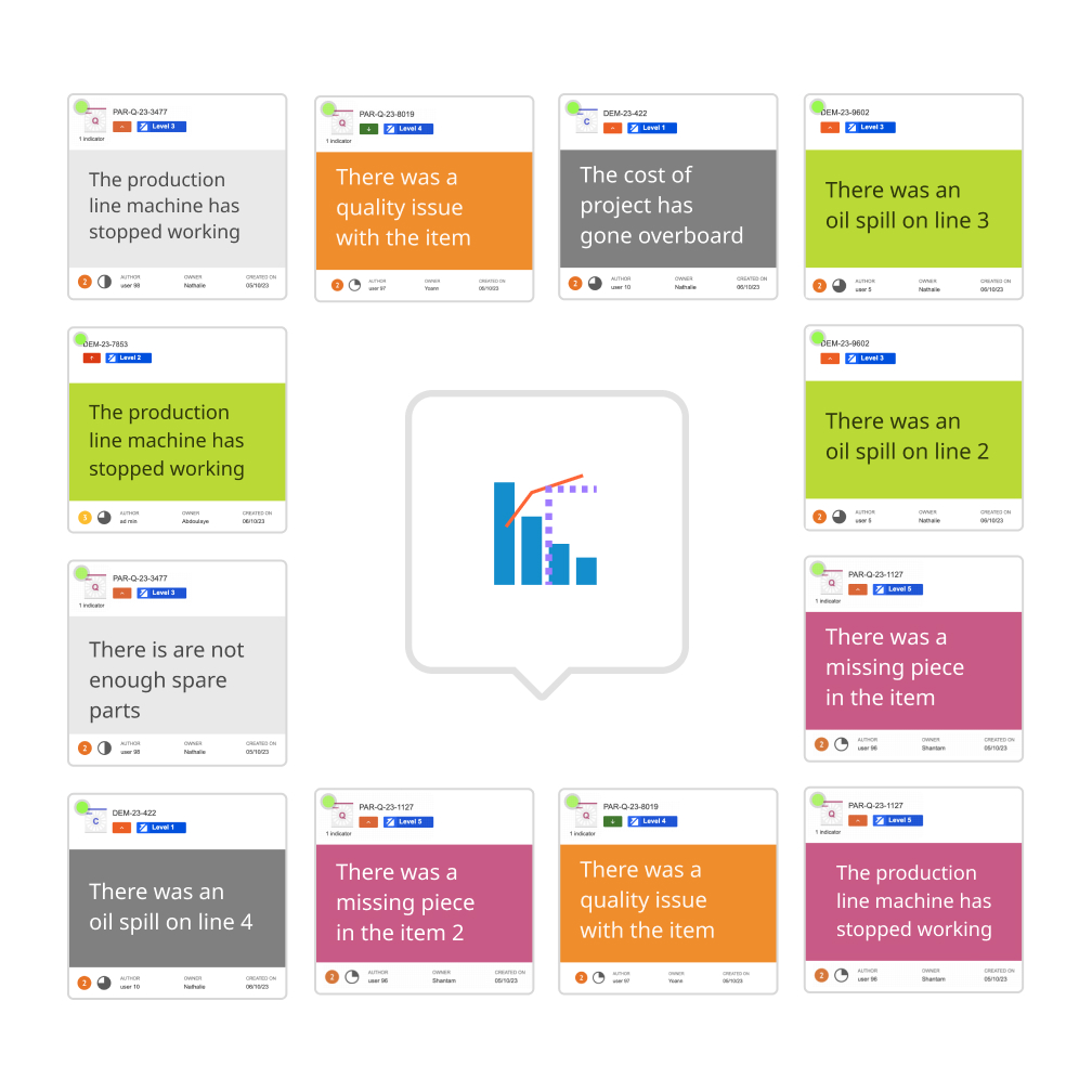
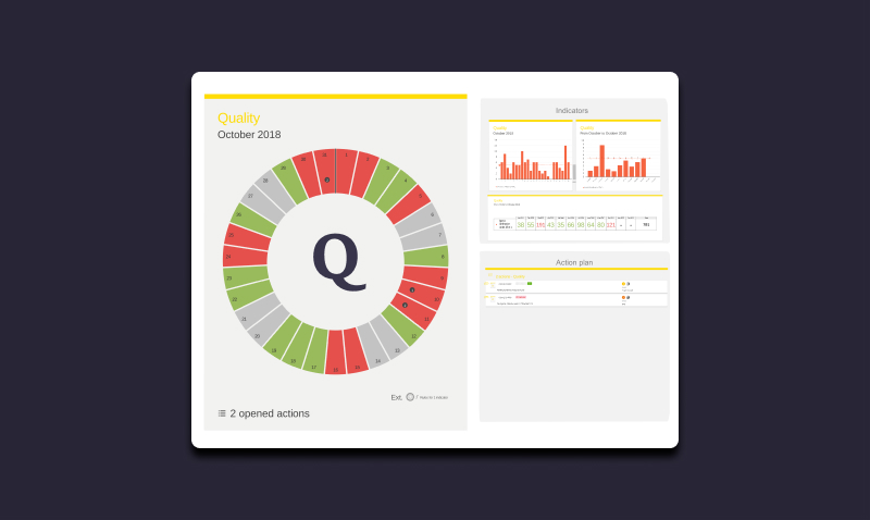
- The Pareto Chart is available in the tool dock, just like other QCD elements
- Users in your rooms can generate real-time reports, closely linked to the field.
- During your TOP5/10/15 rituals, stop waiting for Power BI reports; easily sort and visualize QCD actions depending on various criteria such as category, QCD letter, QCD indicator, escalation type and more.

Accelerate Decision-Making

- Engage all hierarchical levels of the organization in identifying the critical issues.
- Assist field teams in pinpointing the real causes of recurring problems.
- Streamline communication by consolidating the core of the problem-solving process on a single platform.
Enhance Team Collaboration
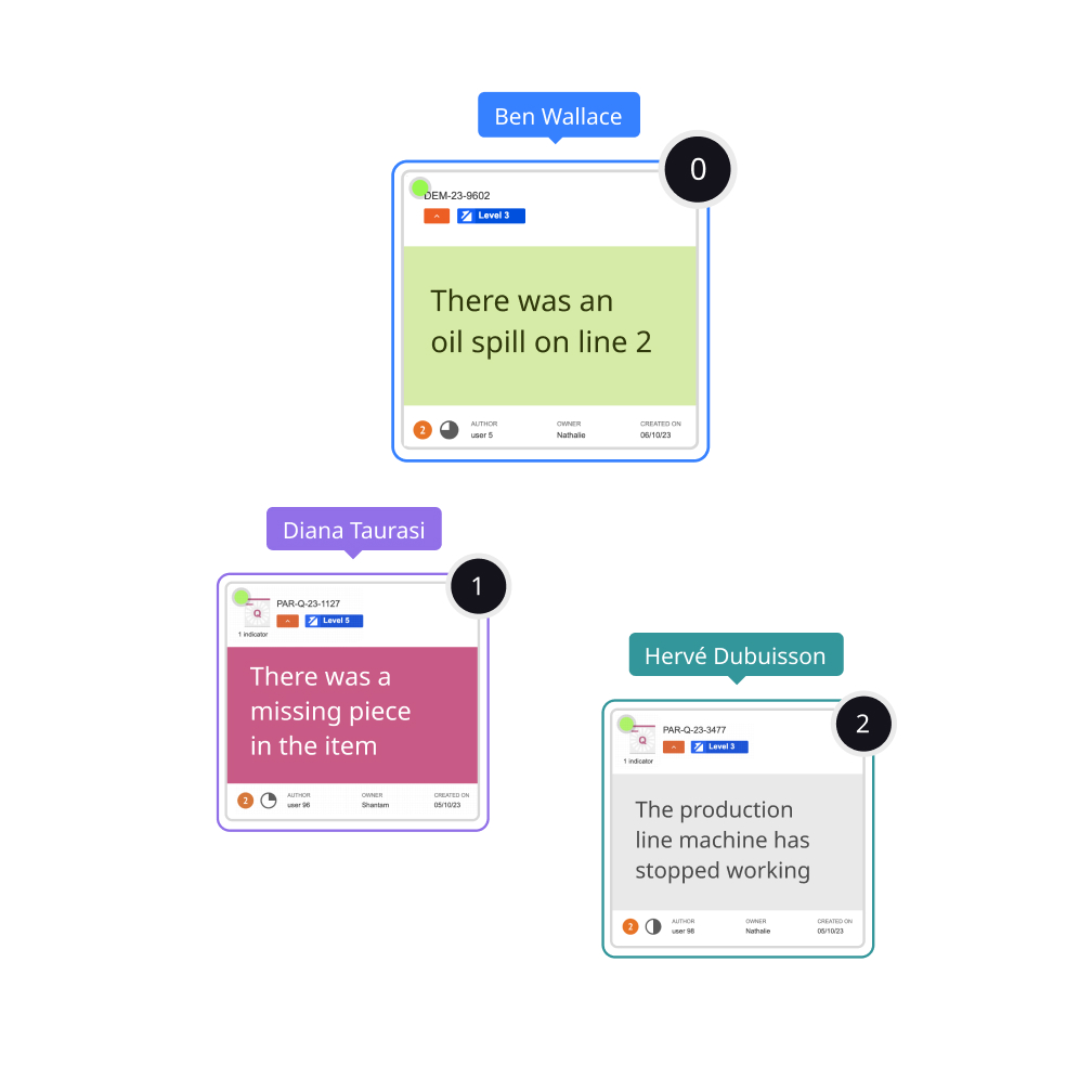
- Involve your teams in resolving day-to-day and company-wide problems.
- Promote collaboration across hierarchical levels of the organization.
- Strengthen the factual approach to problems through the "Pareto culture."

Trusted by top companies


