Hey, let’s start your
iObeya journey!
Following the previous article about our Daily Meeting management, this one goes deeper in the iObeya Board we manipulate to drive each session: I will explain how we structured it and the way we use it.
First, a custom background has been designed (here, in PowerPoint) so every area is clearly defined and can be identified quickly at a glance. When designing a visual management board in iObeya, the logic regarding the allocation of the elements between the background and the content is most of the time the same: things that won’t often change are in the first, things that need updates frequently in the second. So here is the background I created for our board:
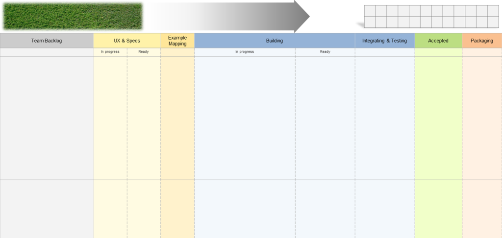
Global information is on top

- Assessment, regarding the current Increment
- A piece of “grass” to simply put fresh news, external subjects we want to share etc
- Links to useful related boards: our Team board (a piece of iObeya Agile@Scale solution) and the global Planning
- The Increment targets ; we get and synchronize here the Feature cards of the Program board (further detail on synchronization below)
- The quote of the day, just for fun. It is automatically filled thanks to a custom Google Apps Script using the iObeya API (I hope to come back to this subject in another article)
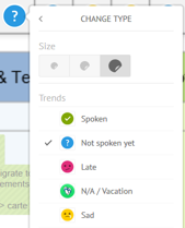
- The attendance / talking stick: We always start by this part of the board to set who is present or not, via a custom set of stickers. Then, we use it to remember who has spoken (as the order changes every time so the last is not always the same, it’s useful for everyone for the follow-up). As soon as someone completes his turn, he decides who is the next speaker. And we also have a red sticker for (very) late people.
Next comes the Kanban…
After few iterations, feedback and sharing with other teams, we have stabilized the workflow with the following steps:
- “Backlog” (/ To-do)
- Design step “UX & Specs”, divided into what is “In progress” & what is “Ready” to do
- “Example mapping”, in which we always try to get our User Stories through (you can read a very good explanation on this topic on this Cucumber blog post)
- “Building”, with two steps: “In Progress” (in development) and “Ready” (means work is in a Merge Request most of the time)
- “Integrating & testing” for the acceptance step
- “Accepted” gives an eye of the work done in the current Increment
- “Packaging”, if documentation / marketing / com’ needed. Most of the time, we create a Jira sub-task linked to the Story and put it here to manage this part
Corresponding columns are colored by theme:
- Grey for the backlog
- Yellow (light/dark) for the UX/UI step
- Blue for the development/test
- Obviously Green because it’s finished
- Orange for the packaging step
... Followed by the main content
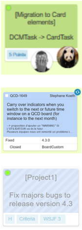
Which is composed of different card elements that can be either common tasks, User Stories taken from our Program board or Jira issues to manage individual tasks or unexpected bugs found in production for instance (no, obviously, never happens…). Sometimes, if we need to add information on these cards, they are associated with standard sticky notes, stickers, annotations, etc.
These cards are really the “true” content of our meeting, they are the main elements people work with, share, comment or challenge. They are there to support the meeting and the related discussions.
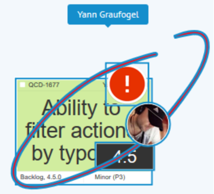
I also like to put on the cards the avatar of main persons (no more than 2! … ok, 3!) working on it, that helps to know who is doing what and to check that nobody is overloaded. It is also more visible when the entire board is zoomed-out.
Last thing regarding the cards: we often use the synchronization feature because some elements often exist on other boards. For instance, User Stories cards are synchronized with the ones in the Program board and can also be with others in order to follow the different products version by version ; Jira cards are synchronized by design etc. So if someone updates the status of a card for example, every related board – most of the time that are not followed every day, rather weekly or biweekly – will be automatically up-to-date.
And that’s it!
We use this board at least once a day but also all day long to review/check/follow/put news… Main modifications and updates (status of Jira issues for instance) are done during the daily meetings so everyone knows the progression of the other team members.
After several trials & mistakes, we opted for this design and this way of working, but that doesn’t mean everything is carved in marble. Continuous improvement is one of the pillars of our model so let’s keep in touch for the next iterations.
Get in touch with iObeya if this is something you would like to explore and implement in your enterprise.

